WPML Custom Language Switcher

Alert: This is a post intended for WordPress web developers.

Are you using the WordPress Multi Lingual (WPML) plugin to manage multi lingual content? Are you happy with how your language switcher button looks? If your website or theme is custom developed or heavily customized – chances are the easy WPML lang switcher widget looks pretty weird jammed into your header, sidebar, or footer. At Mockingbird, we like to have easily accessible language switcher buttons somewhere in the header. When possible, we will use a custom WPML language switcher to allow more consistent design and a stronger UX. We also try to built our sites as light as possible, using a custom switcher allows you to disable the WPML lang switcher stylesheet, removing 1 more stylesheet from your loaded resources!

The Code

I recommend using the plugin settings – “Link to home of language for missing translations”. Make sure not to use the WPML lang switcher widget in addition to the custom switcher if you have disabled the required stylesheet. You will of course need to style this custom switcher yourself. The php, html, and settings are of course editable, you can find documentation here. WPML has released a Twig solution for a custom switcher to avoid PHP, which seems needlessly complicated – learn more about that here.

The code below will need to be placed in the necessary theme file/location to function correctly. I develop child themes for the Genesis Framework and place this custom switcher code in the functions file within a header area hook. See below:

SPAM is for Eating, Not for the Internet

Google recently posted a blog with some tips on how to keep user/bot generated SPAM from ending up on your website. I’ve italicized user/bot because I don’t want you to get your SPAM confused… We’ve written about Google Analytics SPAM numerous times. This stuff is a little different, though it can be related.

Protecting your website from user generated SPAM is important because it can cause serious issues with your website in the eyes of Google. SPAM can be a source for malware or injected links. It can even go as far to result in your website being hijacked completely. Google doesn’t want to show a malicious website (or potentially malicious) to any of its beloved users, so act accordingly!

The major source for user generated SPAM on a Law Firm website is your blog comments. If you aren’t already, you should enable email notifications whenever someone comments on one of your blogs. This way you can act quickly.

Here are the tips from Anouar Bendahou, Search Quality Strategist at Google, to fight this type of SPAM (I’ve bolded my favorites):

  • Keep your forum software updated and patched. Take the time to keep your software up-to-date and pay special attention to important security updates. Spammers take advantage of security issues in older versions of blogs, bulletin boards, and other content management systems.
  • Add a CAPTCHA. CAPTCHAsrequire users to confirm that they are not robots in order to prove they’re a human being and not an automated script. One way to do this is to use a service like reCAPTCHASecurimage and  Jcaptcha .
  • Block suspicious behavior.Many forums allow you to set time limits between posts, and you can often find plugins to look for excessive traffic from individual IP addresses or proxies and other activity more common to bots than human beings. For example, phpBBSimple MachinesmyBB, and many other forum platforms enable such configurations.
  • Check your forum’s top posters on a daily basis. If a user joined recently and has an excessive amount of posts, then you probably should review their profile and make sure that their posts and threads are not spammy.
  • Consider disabling some types of comments. For example, It’s a good practice to close some very old forum threads that are unlikely to get legitimate replies. If you plan on not monitoring your forum going forward and users are no longer interacting with it, turning off posting completely may prevent spammers from abusing it.
  • Make good use of moderation capabilities. Consider enabling features in moderation that require users to have a certain reputation before links can be posted or where comments with links require moderation. If possible, change your settings so that you disallow anonymous posting and make posts from new users require approval before they’re publicly visible.Moderators, together with your friends/colleagues and some other trusted users can help you review and approve posts while spreading the workload. Keep an eye on your forum’s new users by looking on their posts and activities on your forum.
  • Consider blacklisting obviously spammy terms. Block obviously inappropriate comments with a blacklist of spammy terms (e.g. Illegal streaming or pharma related terms) . Add inappropriate and off-topic terms that are only used by spammers, learn from the spam posts that you often see on your forum or other forums. Built-in features or plugins can delete or mark comments as spam for you.
  • Use the “nofollow” attribute for links in the comment field. This will deter spammers from targeting your site. By default, many blogging sites (such as Blogger) automatically add this attribute to any posted comments.
  • Use automated systems to defend your site.  Comprehensive systems like Akismet, which has plugins for many blogs and forum systemsare easy to install and do most of the work for you.

How to Find (And Fix) Orphan Pages

What is an Orphan Page?

An orphan page is a page on a website that is not linked to by any other page on the site. Think of the internet like a perfectly built spider web, each strand connected to another. Now imagine, a couple feet away from the web, a strand of silk hanging mid-air, all by itself. It’s still a piece of web, and would be helpful to a spider if the spider could reach it, but this spider can’t jump, and the strand of silk is useless. This strand of silk is an orphan page.

Orphan pages are rarely stumbled upon by users. This is because a user would have to access the page directly (via URL search) or via sitemap, which doesn’t tend to happen.

Some orphan pages are orphaned intentionally. These are private pages used by webmasters that aren’t intended for users to stumble upon. But we won’t worry about these pages in this post.

Why Should I Care?

At Mockingbird, checking for orphan pages is part of our technical audit. It’s one of the many indicators we use at the very beginning of an engagement to asses a client’s website health. Lots of orphan pages = website health could be improved. Why is this the case?

  1. You might have valuable pages orphaned. Sometimes this happens accidentally. This could mean that you have great content on your site, but, as it isn’t linked to, a user will never find it naturally. This is bad for the user, but not only this, you’re missing out on the potential online credibility coming from your valuable content. People don’t link to pages that they can’t find. Search engines wont have the opportunity to recognize you as an online authority on any subject if your best pages aren’t getting seen, linked to externally, or talked about.
  2. Orphan pages might bring penalties. This is a debated point among SEOs. Some speculate that, upon discovering orphan pages on a site, search engines will treat these pages as doorway pages (unnatural pages intended to rank artificially high for certain search terms to bring in users), and penalize the site. Most disagree, but in this case it’s worthwhile to error on the side of caution.

How Do I Identify Orphan Pages?

There are plenty of ways to identify orphan pages on your site, but no matter how you get the it, all you need is:

  1. A complete list of every page on your site
  2. A complete list of every crawlable page on your site.

For (1.) I use the xml sitemap*. If this sitemap is working correctly, it should be updating automatically each time a page is added to your site, regardless of whether or not it’s orphaned.

For (2.) I use Screaming Frog. Screaming Frog crawls the site as a Googlebot/Bingbot would. This means it starts at the homepage and works down, exploring each link it encounters on its way. Because Screaming Frog works in this way, it excludes pages that are not linked to on any other page. You called it, orphan pages.

Now that you have both a list of every page on your site, and a list of every crawlable page on your site, it’s time to compare. Bring both lists into an excel spreadsheet and run a duplicate check. All pages that don’t appear in your spreadsheet twice (these should be the pages that appear in your sitemap, but not Screaming Frog) are orphan pages.

What Do I Do Once I find Them?

This is the easy part. If you’ve found unintentionally orphaned pages on your site, assess their value. If an orphaned page has thin content, duplicate content, or is outdated, you’re better off without it. Noindex these pages. For valuable, relevant orphaned pages that you find, link to them from a natural page. Put yourself in the user’s shoes and imagine where your orphaned page would be the most helpful. If you discover an orphan page on your auto website called “Everything You Need to Know About Pistons”, your “Engine Parts” page would be a great candidate as a page to link from.


*In order to access this, just tack “/sitemap_index.xml/” on to the end of your homepage URL.


Web Design That Works

There is web design that works, web design that doesn’t work, and a whole lot in between. Design is holistic – it is not just the skin or wrapper for your website. That’s why we hear many different terms around design – Product Design, Web Design, UX Design, Front-End Design, Full-Stack Developer, etc… All of these are skills or job titles entangled in the web design/development department. Design is not based around one question – “Does it look good?” – that’s aesthetics. Design (look it up) encompasses different ideas to create a product or experience for a business or person to interact with. Is it easy to use? Does it relate to me? Does it relate to a business? Is it trustworthy? Does it look good? Is it ethical? Good design can answer all of these questions and more. When you introduce an ever evolving platform like the web, it complicates design further. My first ever “web design” book in school – “Don’t Make Me Think” – was old then, and the principals still apply today.

The design needs of websites definitely vary, depending on the purpose of the site, but for law firms, there’s a number of things that will definitely get you more clients.

1. Contact Information

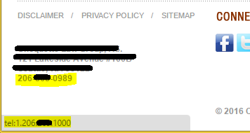
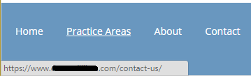
Your contact information shouldn’t be hard to find! Too often we see law firm websites with no phone number in the header and not so much as a contact form or address on their home page. How are they supposed to contact you for a consultation? What if your contact page link is hidden away in a sidebar? At Mockingbird we have one hard and fast design rule – the phone number goes in the header. Visitors should not have to look around to find your phone number! We also like having your address in the footer on every page of your site and likely an email contact form on every page (this should also stand out!).

2. Space

Empty space makes information and design stand out. If I hear “above the fold” one more time, I hope it’s the last. This is a design term from the newspaper era that carried over to web design when users weren’t all familiar with the “scroll” function within a browser. Studies show that this is no longer the case – especially with the emergence of mobile devices and websites. Some users will start scrolling before a page finishes a 1 second load time! Sure, it’s good practice to have the most important information at the top of the page, but an interested user is likely to scroll until they find what they’re looking for. Empty space around your, logo, buttons, phone number, text, calls to action, etc… can help raise conversion rates. So if you’re forcing your web designer to cram as much information as possible “above the fold” – you should have some data behind it explaining why.

3. Simple Navigation

Navigation is so obvious that it’s almost not worth mentioning, but some websites are still getting it wrong. Make sure you have a top bar/header navigation menu, whether it has everything listed or as a drop down. This is a trend that today’s web users are going to expect and as a small business, you would be remiss without it. For users that don’t prefer navigating that way, you’re going to want to give them other options! This is why I like to include a variety of tools from breadcrumb navigation to home page icon buttons.

4. Buttons that Stand Out

Your buttons should be easy to find. A “Send” button that stands out is one of the quickest ways to signal a contact area to a user. Contrasting colors with some sort of differentiating design feature like rounded corners will make your buttons stand out. They quickly indicate to a user, especially fast scrolling ones, that this is an area where they can take action.

5. Calls to Action

Pair your buttons, links, or contact information with Calls to Action. This text will pull the user in, engage them, and encourage – you guessed it – “ACTION’! This text should be short and attention grabbing.

6. Custom Professional Imagery

So many websites and advertisements today use stock photography or clip art, it’s available cheaply or freely. Good designers can make this stock imagery look like it really belongs to your website and is important to your law firm. However, professional photography and branding that belongs to your firm takes your website to the next level. If the photography/branding can project some personality and feeling to a visitor, it’s going to create a much stronger connection. This connection can increase your website’s chance of conversion. I’ll lump video in here as well. If you have professionally created video on your website that engages a visitor it can seriously increase conversion. Custom imagery and video done correctly is another strong signal to search engines that you have quality, original content.

7. About Me

Your “About Me” page, or Law Firm Overview, or Team page, whatever you want to call it is another important aspect of design. It can be a high traffic, high converting page. Having strong, engaging content on your “About Me” page can really boost your conversion rate. Designers can highlight links to this page with buttons and calls to action. Further, you might want to include some special design on that page with professional imagery to further connect with visitors.

Wrapping Up

These 7 Web Design (focusing on aesthetics) basics are simple, important aspects that can seriously boost your conversion rate. If you’re missing any of these things, you should seriously consider addressing them and starting a discussion with your Web Designer!

Sometimes It’s the Little Things

As 2016 limps to a close, it’s apparent this year has been rough for a lot of people, for a lot of reasons. While I am typically an optimistic person who sees the glass half full, there comes a time when a heated rant isn’t just warranted, it’s necessary.

“But Nate, when life gives you lemons, just make lemonade.”

No! I don’t want lemons, and I don’t like lemonade! Just give me my Bulleit Bourbon, neat, like I ordered.

The following is a list of 20 terrible things I’ve seen this year while working on law firms’ websites. Whether I inherit a well-intentioned DIY site, or take over another agency’s misguided attempt at SEO, there always seems to be something glaringly obvious that makes you wonder what these people did before they hired us. If you recognize any of these from your own site, you might want to make some quick updates before the new year.

20 Terrible Things I’ve Seen On Law Firm Websites

  1. Every page has the same title
  2. Every page has four identical H1 tags
  3. Homepage doesn’t have a phone number
  4. Homepage still has generic “filler” text
  5. Contact page shows a bunch of code instead of the actual contact form
  6. Contact page has an embedded map with the pin of a competitor
  7. Contact form doesn’t deliver the lead’s contact information
  8. Contact form thank you page displays a competitor’s phone number
  9. No confirmation when submitting contact forms (the form just goes blank)
  10. Clicking the phone number dials a completely different non-working phone number
  11. The robots.txt file sets the entire site to no index
  12. Links go to pages not even closely related to their anchor text
  13. WordPress login information in the footer (admin/login, WordPress copyright, etc.)
  14. Google My Business Page doesn’t have a website
  15. Images are all the 10+MB original super high quality large stock photos
  16. Images are terribly cropped, stretched, and/or squished
  17. Site has a page that lists all the surrounding cities/counties, and nothing else
  18. Site has unnecessarily long, keyword stuffed URLs
  19. Site has zero structure and all URLs are top level
  20. Copyrights are outdated

While all these things are unarguably terrible, they are all concurrently easy to fix. So, I guess after all that, I am still able to find some sort of silver lining. Maybe this was therapeutic. Maybe there is still hope for the new year. In any case, just make sure to check on #20 next week and let’s all leave 2016 behind.

/rant.

Complete Guide to Understanding and Transferring a Domain Between Registrars

For this tutorial, I use examples and link to resources that explain how to transfer a domain name from GoDaddy to Namecheap. These specific examples will vary depending on which registrar you’re transferring from and which registrar you transfer to, however, this complete guide can serve as a basic outline for most registrars.

Cool blog Robert, just tell me the steps!

Glossary – definitions that you’ll want to understand

Domain name – Your browser (Chrome, IE, Firefox, Safari) uses these to identify one or more IP Addresses. You type a domain name into the address bar of your browser to get to a website. Amazon.com is a domain name. These allow you to remember words instead of a string of numbers to get to a website.

Registrar – An organization that manages the reservation of domain names. You can think of this as the place where you purchased your domain name. Popular registrars are GoDaddy, Name.com, Namecheap, iPage, Network Solutions, and Blue Host. I highly recommend Namecheap.

Website Host – Often referred to as a Host, it’s the place that has all the files and information pertaining to your website. This can be provided by your registrar, or a different third party company. Many of the popular registrars mentioned above are also popular website hosting companies. However, we use a managed WordPress hosting company called WP Engine for improved speed and security.

DNS (Domain Name System) – This is the system that the Internet uses to convert a domain name into an IP address (or IP Addresses).  You can think of it as a map of instructions on where the internet finds important information related to a domain name, like where a website is hosted.

NS (Name Server) – Technically I’m referring to a Root Name Server here: This server (which is a technical way of saying a computer that provides a service) points the internet to the place where your DNS is setup. When you purchase your domain from a registrar, it usually comes setup with two of their default name servers. You or the person who built your website may have changed these to the name servers for the hosting company your website is using. Common default GoDaddy name servers look like this: ns01.domaincontrol.com and ns02.domaincontrol.com.

A Record, CNAME Record, MX Record, TXT Record, SPF Record – DNS records that give the internet directions on what to do with certain things relating to your domain. Example: MX Records for a domain are the instructions for handling email. If you improperly move or configure these, your email could stop working.

Why you might want to transfer a domain name from one registrar to another

  • You’ve purchased your domain name through a website provider/CMS like Weebly and you’re cancelling their service.
  • You’ve purchased domains through a variety of registrars and are trying to organize and keep track of fewer logins
  • You hate your current registrar and you’ve heard about how awesome Namecheap is
  • You’ve bought or sold a domain and need to move it between registrars.
  • Someone bought and setup your domain for you and they no longer want/can/are willing to handle that for you


General Domain Name Transfer Process

Option 1: Call 206-209-2125 and have us to do this for you.

Option 2:

  1. Verify the domain name can be transferred and read through these steps entirely before beginning the transfer process.
  2. Prepare the domain name for transfer* at the current registrar and acquire an Authorization/EPP Code. This must be done by whomever has current registrar access for the domain.
  3. Initiate the transfer from the registrar you’re moving the domain name to and input the Authorization/EPP Code.
  4. Accept the domain name transfer request from the administrator email of the domain.
  5. Wait for the transfer to complete within 5 days.

*If you put in some extra work and setup a third party DNS, you will limit the amount of time your website is down (if any) during this process.

Step 1: Things to know before you begin to transfer your domain name:

  1. You can transfer a domain name if it has been registered more than 60 days ago.
  2. You can transfer a domain name if it hasn’t been transferred in the last 60 days.
  3. The domain must have a valid and accessible admin email address in the Whois database. I recommend that you disable any type of Whois privacy protection/private registration before transferring the domain. Some registrars require it.
  4. The domain name cannot be expired. Domain status must be ‘OK’ or ‘Active’ and unlocked.
  5. Once transferred, you cannot transfer the domain name again for 60 days (see #2).
  6. Transfers may be denied. Example of reasons for denial are:
    1. Evidence of fraud,
    2. court order by a court of competent jurisdiction
    3. Reasonable dispute over the identity of the registered name holder or administrative contact,
    4. Failed Payment
    5. The domain name is locked (see #4)
    6. A domain name is less than 60 days old (see #1)
    7. A domain name was transferred less than 60 days ago (see #2 and #5).

Step 2: Prepare the Domain name for Transfer

  1. Disable your domain name privacy/private registration
  2. Make sure you/someone has access to the Administrative Email for the domain.
    1. Look up the domain in a Whois database. Take note of the administrative email for the domain. Someone should have access to this!
  3. If the name servers are with the company you’re transferring your domain name away from, I recommend setting up your DNS through a third party and pointing the NS to this DNS before you transfer the domain. You simply copy all the A records, mx records, txt records, and anything else that is on your domain to this third-party DNS. This way, when the DNS is in limbo at the registrar level, your site and email will remain up on the web. I recommend using Namecheap’s FreeDNS service. Especially if you’re transferring the domain to Namecheap – they will change the NS to theirs and keep all the domain records intact. Keep in mind that NS updates take 24-48 hours to complete!
  4. Unlock the domain name
  5. Obtain the Auth/EPP code from the current registrar.

Step 3: Initiate the transfer to Namecheap

  1. Once logged in, select ‘Domains’ from the menu at the top and select ‘Transfer a Domain’.
  2. Enter your domain name & Authorization/EPP code separated by a comma. Example: domainname.com, E8R8;Q893*5SH00
  3. Click ‘Start Transfer’ and Namechep verifies everything in step 2 is correct and the domain is prepared properly. Pick the administrative email address for the domain to have the verification email sent to. Again, you or someone should have access to this! Click ‘Add to Cart’ and add any coupon codes you have lying around.
  4. Proceed to ‘Check Out’ for payment. Generally, around $20.

Step 4: Accept the domain transfer via email

Delivery of this email can take a couple hours, and it can often end up in the spam folder of the administrative email account for the domain. By now, you should have already verified that you or someone involved in the domain name transfer process has access.

Once you’ve accepted the transfer request via email, the registrar you’re moving the domain name from has 5 days to automatically release the domain. You should receive a confirmation email to the email address on file at the new registrar once it is complete!

Namecheap provides a lot of good resources, one of which is a matrix of Transfer Statuses and what to do in each situation.

Resources that I think are extra helpful outside of this complete guide:

Design Resources for Law Firm Websites

Are you blogging regularly on your law firm website? Maybe you’re considering a website redesign? Or perhaps you’re just looking to improve your existing content? You may even be a designer looking for some extra tips.

Updating a website or just adding photos to your blog posts can be a time consuming and expensive process. This post is meant to provide some free and/or easy to use resources to help you keep your website fresh.

Images

Looking for high quality stock imagery for your blog posts or pages? A standard Google image search + copy/paste just won’t cut it (that usually falls under the category of theft). There are plenty of premium services out there. Here a few of my favorite (these will charge $5-$10 minimum per image or a monthly subscription model option):

Free Image Resources

If you’re looking for some easy free imagery, you’re going to lose out on quality, but those resources exist in droves. Sometimes you find some real gems, but you may have seen them used elsewhere online. Some of these resources require the use of (free) Creative Commons licenses – make sure to look for that! Here are some of my favorites:

  • Unsplash (The unparalleled success example of a free stock photo site. Mostly landscapes, very high quality, totally free.)
  • AllTheFreeStock (Aggregate of free stock resources – sometimes too much to handle!)
  • Creative Commons Search (Here you can search for CC licensed material from Flickr and other resources. Make sure to give credit/request use when necessary.)
  • Compfight (Similar functionality to CC search, but will provide you a CC license HTML credit snippet with the image!)

Custom Imagery

Nothing beats original content! If you have the means or ability to get original photos and/or illustrations – I recommend you make it happen. Your readers will love your original content.

Website Redesigns

Here at Mockingbird, we build all our website on the WordPress platform. Keep in mind, there’s a million and one ways to create a WordPress website.

Designing in WordPress isn’t always easy, especially depending on the theme you’re using. If you have WordPress questions, the best place to find answers is through the WordPress.org website or through a Google search. There are millions of WP users out there. Chances are, the answer to your question already exists on the web.

If you’re considering a move to WordPress or a WordPress website redesign – I have a recommendations for you. Make sure your theme or developer optimizes for SEO. You shouldn’t be getting multiple h1’s on every page or a non-mobile-friendly website. It doesn’t matter how great your site looks if you are facing major SEO problems like these.

WordPress Themes + Developers

  • Genesis Framework by Studiopress (I start here. You can get child themes for the framework, or hire a developer to build you one! Genesis is a perfect starting point.)
  • Custom coded theme (Make sure your developer/designer knows what they’re doing, I’ve seen some of the worst SEO problems on beautifully crafted custom themes.)

Building Your Own Site? Not a developer or designer?

This can be done, but make sure you research your SEO best practices! Designing with WordPress can be extremely easy if you aren’t too picky. Grab a theme, adjust some settings, add your content – BOOM done. Want to move your logo up 20 pixels? You might need a web designer for that :(. If you plan to design yourself, I have some themes to recommend:

  • Studiopress Themes (Again with Genesis by Studiopress! These child themes probably take the most knowledge to customize, but it can be done!)
  • The Seven Theme (I’ve used this. It may have more options than you could ever want, but you can make almost any design happen with the visual composer plugin.)
  • Keep it simple (Find a simple theme you love with limited options.)

Hosting? We recommend using a managed WordPress host for your site – we love WP Engine.

Designer/Developer Resources

If you’re a web designer and developer, you might already know about all of these resources. If you don’t, I suggest taking a peak!

All The Links

Blogs

Icons

  • Font Awesome (This is a free font style sheet that has to be loaded on your site, but can be implemented in content with HTML)

Colors

Video

  • Coverr (Free cover video resource.)

The Finale

I could keep linking and sharing resources that I use for another few pages, but I’ll stop here. Hopefully, you found some of those links helpful and good luck with your image searching!

Shameless plug: If you’re in need of a well designed, SEO friendly Law Firm website – we make those!

FindLaw Abandons Another Law Firm

It’s Halloween so, a perfect time for a scary post about a ghoul in our midst….

You’ll remember about a year ago, we knocked out a website for Kendall Coffman in 24 hours after FindLaw pulled the plug on his site – leaving it looking like this:

404 Coffman

So yesterday, we got the same call – another law firm abandoned by FindLaw, leaving their site naked in the breeze.  This time, we turned around a new site same day.  Now that’s not easy – it involved pulling our fire alarm – getting all hands on deck and working with our Echo WordPress template to push something live really quickly.  And we didn’t engage in rounds and rounds of creative revisions or discussion on the shade of blue in the background.  BUT…. within 8 hours of getting his inquiry – the new site is up and running and 100% technically sound. Designed from our Echo template, it includes:

  • attorney bio pages complete with attorney specific testimonials
  • removed FindLaw’s toll-free “tracking” numbers.
  • contact forms
  • legacy GA code
  • on-site search
  • social media integration
  • contact us page complete with Google maps integration
  • mobile responsive design with sticky phone number header.

Oh – and while I’m ranting about FindLaw…. unfortunately the firm had been paying FindLaw to write blog posts for them – except the devious, self-serving, underhanded, fine print in their agreement meant that FindLaw retained ownership of that content. So while Echo can handle blog functionality, unfortunately the firm’s new site will be blog naked (for now.) Imagine that – here’s a law firm paying FindLaw to develop content for them – that they, in fact do not own.  Kind of like buying a house only to find out your mortgage is actually a lease.

Technical Roadmap for Leaving FindLaw

And for law firms, or other agencies facing a similar FindLaw induced marketing disaster, here’s a roadmap of the technical issues to handle:

Here is a summary of everything we did – taken from our instructions to our client, Justin:

  • Moved all content that we could find archived on the web except for the blog roll as well as leveraged the Word document you provided – please use your sitemap to go through the content. Please also review the disclaimer and Privacy Policy.
  • Updated all the phone numbers in content/meta descriptions/header/footers to your direct line and removed toll free “Findlaw” numbers.
  • Copied the Google Analytics code as it was on your previous site. We highly recommend verifying you have ownership over this Analytics account. If not, try to obtain.
  • Kept the Google Search Console verification tag. We highly recommend verifying you have ownership over this Search Console account. If not, try to obtain.
  • Created a Bing Webmaster Tools account and gave you ownership.
  • Updated ALL the internal links. Since your site is now on WordPress, all the URLs end with a slash (/) instead of a combination of slashes and “.shtml”. Since we were manually migrated the content we could get our hands on, it was easier to update these on the go.
  • Migrated all the page Titles and Descriptions. Again, easier to do on the fly.
  • Created 301 redirects for:
    • all URLs ending in .shtml to point them to the new URLs with “/”.
    • Duplicate legacy contact form we found during migration
    • Attorneys URL to force lower case “A”.
    • Blog roll and blog. Note: This redirect will need to be revised if you choose to utilize the blog feature on your new site.
  • Setup and configured Yoast SEO
  • Updated Robots.txt and included your XML sitemap location
  • Configured contact form with a ‘thank you’ destination page and Google Event Tracking. Tested and confirmed working.
  • Crawled post-launch site
    • No internal 404 errors (this means all the links on the new site work!)
    • No internal 301 redirects on pages (this means that all the links go to the final destination, which is how it should be!)
  • I’ve also added 3 more “properties” to your search console account. The one you want to use is XXXXXXX. We can cover this during the demo.
  • I was also afraid that FindLaw would see my updates so I have added us as owners to these tools and removed permissions for the email you provided to manage users. I would recommend giving us a gmail account (or you can register your current email, which is through Office 360, to be used with google products) so that we can add that as owner for everything. This prevents FindLaw from taking access away.
  • Finally, I submitted the new site to be indexed by Google through Search Console. This should help get those blog posts you don’t own out of the search results. It will also help Google understand what in the world just happened.
  • Allowed site to be indexed by google
  • Added you as a user to the new site – you should have received an email with a PW
  • Added you as a user to your new host (WP Engine) – you should receive an invitation email to create a PW
  • Added your website back to your Google My Business listing and it was immediately published

Why Great Design and UX is HUGELY IMPORTANT for Law Firm Websites

Search Engine Optimization with a “VP of Marketing” mindset continues to be Mockingbird’s business focus. We focus on generating high returns for our client’s marketing investments. Search Engine Optimization (SEO) encompasses a broad set of tactics that bring more visitors to our client’s websites. Mockingbird often supplements our SEO engagements with measured Pay-Per-Click and Display advertising campaigns. Our strategies widen the top of our client’s marketing funnel. But, what about the website visitors? How can we increase the likelihood that they start a contact through the website they’re visiting? The real people using a website can be forgotten with the focus on analytics, traffic numbers, and number of leads generated.

Enter Design and UX (User Experience).

Design and User Experience

Design has historically been a constant factor in marketing and business strategy. Your branded website needs to convey your firms personality and garner trust. People connect with good design – they know it when they see it. There is no scientifically proven “best” design, color, or font, but your web design should communicate your brand and connect with your potential clients.

User Experience (UX) might be an overly broad term… It combines many different skills and professions into a job that ensures people are having the best possible experience with a technology product. This can start at the top of the funnel with the copy of your PPC ad, all the way to the experience they have on the phone with your front desk. Every interaction with your law firm matters, whether it’s on a Google results page, on your website, or on the phone.

UX is becoming more important with every passing year and each technological advancement, so there’s a reason UX Designer is the fastest growing design position at large companies. UX designers are becoming CEO’s and company founders at a great rate because of their broad understanding of data, users, design, and business. You might be asking… “Why are you telling me all this? UX might be important for big product companies, but not for me… I just want people to find my website and call me!” But, there are a lot of design and UX wins to be had for law firm websites that can grow your business.

User Experience Improvements Increase Conversion Rates

If you could double the amount of calls you get from your website by testing and improving user experience – would you? Of course! If your website is missing some of these easy wins, making these changes could significantly improve your conversion rates. Many of these items overlap with design, UI, SEO, content, etc… But together they make up the entire User Experience.

Easy Wins

See below for easy UX wins, or as Conrad would say – “low hanging fruit”.

Links

Do: Internal Linking. Don’t: Broken links, 404’s, broken images

Your website shouldn’t have any broken links! Images and/or broken page links will drive away visitors and potential clients. Internal linking or links to other pages from within your text content can improve conversions. A strong main navigation is important and a web design staple, but people navigate websites differently. Navigating to different pages should be effortless for your users – so provide them with more ways to do it!

Contact Information

Do: Easy to find, complete contact info. Don’t: Force one contact method or provide incomplete contact info.

Make sure your phone number is easy to find in your header! If they can’t find your contact information, how are they going to call you? Your site should include complete business contact information on your contact page to increase trust. Show that you have a real location, people, phone, fax, etc… Use simple calls to action, these will make visitors use your contact info.`

Contact Forms

Do: Use contact forms. Don’t: Require too many fields and overbearing security measures.

A strong contact form will generate a lot of leads. Your forms should have as few fields as possible, and as few required fields as possible. I suggest Name and Email as the only required fields. I would recommend against Captcha security fields – this can stop visitors from using your form. Try other security/anti-spam measures instead, and include a security message/disclaimer below your submit button.

Client and Peer Reviews

Do: Display reviews of your services, professionalism, and what sets you apart. Don’t: Create fake reviews or use reviews without permission.

Using select reviews from your clients and peers increases the trust level on your site. Real photos can take these to the next level. Visitors to your website will be more likely to contact you if they trust that your glowing reviews are real and personal.

Live Chat

Do: Use a subtle live chat. Don’t: Aggressively pursue chat leads with screen blocking popups, too much motion, and repeated offers.

Live chat can be extremely successful when used correctly, especially for certain practice areas. Everyone communicates differently; certain visitors will prefer a live chat option over any other contact method. However, don’t overwhelm and scare away your other visitors with overzealous chat options.

Original Photos

Do: Use professional, original photography. Don’t: Overuse stock photography or your iPhone office photos.

Professional photos go a long long way. A professional photographer will be capture your personality and law firm values. These images will communicate with your visitors on a personal level before they ever speak with you. Photos can make you look strong, powerful, friendly, professional, etc… Visitors are more likely to pick up the phone after feeling/seeing these emotions. Just reading your tagline isn’t quite the same.

Content

Do: Write your own content. Don’t: Fill your website with daily “legal” blog posts and news rewrites, or hire a content writer without them ever speaking with you.

Legal is different. It’s hard for content writers without law degrees to write law firm website content.  Most law firm websites use cookie cutter, outsourced content. Bloggers are hired to vomit news rewrites weekly. Marketers can add calls to action and some marketing spins, but you are your best content writer. If you can write 10-30 fantastic pages about your services, experience, personality, and answer clients frequently asked questions – you’re a cut above the rest. You know your clients better than anyone. What is helpful to them? What questions do they ask you first? What do they need to know before they contact a lawyer? How much do your services cost? You can answer all of these questions on your website better than anyone else.

Other UX Factors

I’ve already covered the easy UX wins that you or your marketing team can easily take care of. But, that was only the beginning!

Load Times

Google has claimed that site speed and loading times are a search ranking factor. Having a fast website isn’t easy or simple. Big box website providers and templates are inevitably going to load more web resources than your site needs. There are some easy tactics that can move the needle, but getting the high speed scores requires a large budget and talented web developer. I would suggest testing your website’s speed, your score isn’t going to look impressive, but the tests will hint at areas for improvement. Try some speed improvement suggestions below:

  • Resize images and save for web with compression. Try Photoshop, Light Room, or WP Smush Plugin.
  • Minimize HTTP requests, move away from templates and big box providers.
  • Use a fast, managed WordPress host like WP Engine (this will take improve caching, compression, and security issues to name a few).

Responsive, Mobile Optimized Design

Many people searching for services are going to make their first encounter with your website on a mobile device. Your mobile website should easily communicate your value and allow easy navigation. Try a click-to-call prompt and measure the results!

Professional, Consistent Web Design

Your web design should provide a consistent professional feeling to potential clients. If your office provides a professional and friendly environment, front desk, and legal services – your website has to do the same.

UX – The Never Ending Process

Web technologies continue to evolve at an alarming rate. There will be new tools and methods a month from now. If you stay away from the bleeding edge and use data and testing to improve your website experience, you’re going to see conversion rates improve. UX is one of the best investments you can make in your business – from the search discovery experience, all the way to their first meeting with you, the attorney.

Dumping hundreds of thousands of dollars into advertising to double your leads is insanely expensive. You might double your conversion rate, with the same old traffic, by spending fifteen thousand dollars on: a new website, UX testing/improvements, and a front desk audit. Choosing UX over advertising can mean a much better return on investment. However, make sure you watch out for vendors peddling UX Myths!

Where are the statistics?

Legal is a tricky industry. There are such differences between practice areas and geographic locations. I had a hard time directly correlating numbers from B2C and B2B studies to the legal industry as a whole. Work with your agency and their reporting data to find your “low hanging fruit” and areas with room for improvement. Below are the various studies that I have read and used as references for this blog post. Reading List:

There’s a ton of data in there all pointing to the same thing – UX is one of the best investments a business can make if they’re marketing on the web. 

To push the point home, here are some pretty graphs. Directly correlated or not, they still offer important insights. Sources – Adobe and Ko Marketing (listed above).

Graphs Graphs Graphs

Annoying Buyers Graph

Content Issues Graph

Content Sources Table

Design Value Graph

The End, Or Is It?

Investing in UX improvements can drastically improve your conversion rates. UX isn’t a cheap fix, or something that is ever finished. It’s not a one and done process. You should have the basics covered if you have a newly designed website, but there’s always room for improvement supported by research and data.

Talk to your agency, talk to your clients, test your product, make improvements, grow your business!