Bird Droppings: What’s happening with featured snippets? And reviews, the top local ranking factor.

Featured snippets are a prime SEO target. Quality content and a number of other factors can help get your content into a featured snippet like a question answer box at the top of SERP’s. The SERP’s are always changing and Google is trying to serve up the best possible content for it’s users. When you have an article in a featured snippet and suddenly that snippet is completely gone from the SERP’s – your traffic can dive drastically. Search Engine Land begs the question – Is the featured snippet bubble bursting?

We don’t believe the bubble is bursting and the tactics to rank for snippets are going to help you across the board anyways. Have you wondered how to rank in featured snippets? There may be a formula!

SEO Articles: Readability Ranks?

Search Engine Journal dives a little deeper into the most prominent local ranking factor (Reviews) from Local SEO Guide’s annual study.

Moz has written a “Next Level” guide on how to track the right keywords and locations for your business – focusing on geomodified searches and localized results. As local becomes more important, this kind of research can help guide your marketing tactics.

Another top 10 article! Weird right? Search Engine Land hosts the Local Search Associations Top 10 local search insights of 2017.

Is your content easy to digest? As the algorithms and robots get less “robotic”, the human elements become more important. Our favorite SEO plugin believes that Readability Ranks!

Legal related links:

If you’re considering spamming your way into the local listings or hiring someone who might, think twice about the implications and what that says about you as an attorney.

Fascinating thoughts about the future of lawyer search (or is it already here?)

Check out Chelsey Lamberts review of Mockingbird on Lextech -> toots horn!

As always, thanks for reading, and let us know if you have any fantastic new SEO resources or Legal Marketing articles.


Bird Droppings: Google Posts might impact search ranking!

Welcome to our second “Bird Droppings” post, offering a roundup up recent articles relevant to legal marketing. Aside from a little Fantasy Football and College Football trash talk, our internal messaging is mainly for sharing our favorite SEO, marketing, and legal marketing content. It’s been a slower few weeks on the news side of things, but we’ve still found plenty of items worth reading and sharing. Check them out below!

SEO case studies, guides and news:

Do Google Posts impact ranking? A case study – A recent study by Joy Hawkins shows that frequently utilizing Google Posts may be a positive ranking factor in local searches.

No Manual Action? Don’t Submit a Disavow – More from Google’s constant fight against spam… If you have bad links pointing to your site, but don’t have a manual penalty against your site – you no longer need to submit a disavow file for those bad links.

Local SEO Guide published their Local SEO Ranking Factors Study for 2017!

Moving offices? Our local expert Dustin Curtis shares his experience moving an office properly online. <– Tooting own horn.

A great post on linkbuilding techniques by our friend, Ross Hudgins.

Get back to the basics with 10 SEO tips from Lawyernomics.

Legal industry related articles:

What Drives Clients to Love or Hate Their Attorney? – AttorneySync explores the question with a data-driven study.

Sorry to call your industry boring Legal, but most people don’t care about your content. Here’s how you can make your content not boring and give them a reason to care – Tangential Content Earns More Links and Social Shares in Boring Industries [New Research]

Small Thanks with Google – A google campaign to get small businesses thinking about their online reputation and to encourage other clients/customers to participate in leaving Google reviews.

Yelp is seriously cracking down on review requests. If Yelp determines your business is systematically soliciting reviews, your business listing may get hit with a ranking penalty. Read about Yelp’s solicitation penalty here.

Misc extras:

WordPress 4.8.3 Security Release – Security update released on Halloween preventing a vulnerability that may be introduced by some plugins and themes. This kind of security release is more important for sites hosted WITHOUT managed WordPress hosting like WP Engine. In fact our host – WP Engine rolled out this update automatically on Nov 1st. We love daily backups, host security measures, and automatic updates!

Did you find any of these articles helpful? Please share your thoughts with us in the comments below!


Bird Droppings: The first of a (mostly) weekly Legal Marketing/SEO links post series

There’s a lot of SEO news out there. The Legal Marketing landscape is constantly changing and the industry is talking about it.

At Mockingbird, we use a Slack channel to share useful resources, guides, and videos to keep each other up to date. We’ve created this Bird Droppings series to share these helpful links with you too!

First, some SEO/Marketing news:

Yext continues to add beneficial functionality for small business management. This latest update allows law firms to utilize Google My Business posts through the same tool we recommend for improving NAP accuracy and consistency. Create Google Posts Directly from Yext >>

We’ve been finding a lot of success with Google’s Call-Only Ads, AdWords is now recording some calls initiated by call-only ads and call extensions.

Search Engine Watch posted a great overview of what HTTP/2, how it benefits users and what it takes to set it up. The next step for law firms obsessed with site speed.

Just in case anyone missed this and you need another reminder – proximity is still the #1 local search ranking factor.

Get the recap and watch the “Google My Business Strategies and Ranking Factors Q&A” webinar featuring some of the brightest minds in local SEO.

Some miscellaneous extras:

We love Google Calendar and use it everyday. Google continues to push its’ Material Design principles across it’s most popular products. Google Calendar is getting an update Wednesday, 10/17/17, try it yourself.

In the wake of a series of recent hacking campaigns, Google will release “Advanced Protection” setting for Google Accounts.

We continue to perform an enormous amount of janitorial SEO work. We unfortunately, still need to share advice from Google’s Maile Ohye on how to hire (or not to hire) and SEO agency. Watch below:


WPML Custom Language Switcher

Alert: This is a post intended for WordPress web developers.

Are you using the WordPress Multi Lingual (WPML) plugin to manage multi lingual content? Are you happy with how your language switcher button looks? If your website or theme is custom developed or heavily customized – chances are the easy WPML lang switcher widget looks pretty weird jammed into your header, sidebar, or footer. At Mockingbird, we like to have easily accessible language switcher buttons somewhere in the header. When possible, we will use a custom WPML language switcher to allow more consistent design and a stronger UX. We also try to built our sites as light as possible, using a custom switcher allows you to disable the WPML lang switcher stylesheet, removing 1 more stylesheet from your loaded resources!

The Code

I recommend using the plugin settings – “Link to home of language for missing translations”. Make sure not to use the WPML lang switcher widget in addition to the custom switcher if you have disabled the required stylesheet. You will of course need to style this custom switcher yourself. The php, html, and settings are of course editable, you can find documentation here. WPML has released a Twig solution for a custom switcher to avoid PHP, which seems needlessly complicated – learn more about that here.

The code below will need to be placed in the necessary theme file/location to function correctly. I develop child themes for the Genesis Framework and place this custom switcher code in the functions file within a header area hook. See below:

Web Design That Works

There is web design that works, web design that doesn’t work, and a whole lot in between. Design is holistic – it is not just the skin or wrapper for your website. That’s why we hear many different terms around design – Product Design, Web Design, UX Design, Front-End Design, Full-Stack Developer, etc… All of these are skills or job titles entangled in the web design/development department. Design is not based around one question – “Does it look good?” – that’s aesthetics. Design (look it up) encompasses different ideas to create a product or experience for a business or person to interact with. Is it easy to use? Does it relate to me? Does it relate to a business? Is it trustworthy? Does it look good? Is it ethical? Good design can answer all of these questions and more. When you introduce an ever evolving platform like the web, it complicates design further. My first ever “web design” book in school – “Don’t Make Me Think” – was old then, and the principals still apply today.

The design needs of websites definitely vary, depending on the purpose of the site, but for law firms, there’s a number of things that will definitely get you more clients.

1. Contact Information

Your contact information shouldn’t be hard to find! Too often we see law firm websites with no phone number in the header and not so much as a contact form or address on their home page. How are they supposed to contact you for a consultation? What if your contact page link is hidden away in a sidebar? At Mockingbird we have one hard and fast design rule – the phone number goes in the header. Visitors should not have to look around to find your phone number! We also like having your address in the footer on every page of your site and likely an email contact form on every page (this should also stand out!).

2. Space

Empty space makes information and design stand out. If I hear “above the fold” one more time, I hope it’s the last. This is a design term from the newspaper era that carried over to web design when users weren’t all familiar with the “scroll” function within a browser. Studies show that this is no longer the case – especially with the emergence of mobile devices and websites. Some users will start scrolling before a page finishes a 1 second load time! Sure, it’s good practice to have the most important information at the top of the page, but an interested user is likely to scroll until they find what they’re looking for. Empty space around your, logo, buttons, phone number, text, calls to action, etc… can help raise conversion rates. So if you’re forcing your web designer to cram as much information as possible “above the fold” – you should have some data behind it explaining why.

3. Simple Navigation

Navigation is so obvious that it’s almost not worth mentioning, but some websites are still getting it wrong. Make sure you have a top bar/header navigation menu, whether it has everything listed or as a drop down. This is a trend that today’s web users are going to expect and as a small business, you would be remiss without it. For users that don’t prefer navigating that way, you’re going to want to give them other options! This is why I like to include a variety of tools from breadcrumb navigation to home page icon buttons.

4. Buttons that Stand Out

Your buttons should be easy to find. A “Send” button that stands out is one of the quickest ways to signal a contact area to a user. Contrasting colors with some sort of differentiating design feature like rounded corners will make your buttons stand out. They quickly indicate to a user, especially fast scrolling ones, that this is an area where they can take action.

5. Calls to Action

Pair your buttons, links, or contact information with Calls to Action. This text will pull the user in, engage them, and encourage – you guessed it – “ACTION’! This text should be short and attention grabbing.

6. Custom Professional Imagery

So many websites and advertisements today use stock photography or clip art, it’s available cheaply or freely. Good designers can make this stock imagery look like it really belongs to your website and is important to your law firm. However, professional photography and branding that belongs to your firm takes your website to the next level. If the photography/branding can project some personality and feeling to a visitor, it’s going to create a much stronger connection. This connection can increase your website’s chance of conversion. I’ll lump video in here as well. If you have professionally created video on your website that engages a visitor it can seriously increase conversion. Custom imagery and video done correctly is another strong signal to search engines that you have quality, original content.

7. About Me

Your “About Me” page, or Law Firm Overview, or Team page, whatever you want to call it is another important aspect of design. It can be a high traffic, high converting page. Having strong, engaging content on your “About Me” page can really boost your conversion rate. Designers can highlight links to this page with buttons and calls to action. Further, you might want to include some special design on that page with professional imagery to further connect with visitors.

Wrapping Up

These 7 Web Design (focusing on aesthetics) basics are simple, important aspects that can seriously boost your conversion rate. If you’re missing any of these things, you should seriously consider addressing them and starting a discussion with your Web Designer!

Why HTTPS? Well that’s a stupid question.

Everybody is moving to their websites to HTTPS! Google says it’s a must. You even get a nice green shield on the url bar – see below – security proven! It’s clear that HTTPS is a good thing for your website and the entire web is moving quickly to adopt HTTPS.

HTTPS Example

Better get on board or your traffic is going to tank! Woah woah woah… That’s not necessarily true, but let’s explore they what, why, and how of HTTPS.

What is HTTPS?

HTTPS is a combination of two things – HTTP(Hypertext Transfer Protocol) and TLS(Transport Layer Security).  This security layer essentially encrypts communications between the website server and the visitors device. It doesn’t protect your device or server themselves from intruders (they should have their own security measures), but it does protect the communications from being read or altered by intruders. This way a visitor to your website can be ensured that their data is not being mined when they send you a contact form message or digital payment. If a website has HTTPS enabled correctly it will have a green shield in your browser’s address bar and “https://” before the site address – refer again to the image above. An incomplete/incorrect implementation will have a red shield, x, or some other error/warning message to go along with the “https://” to warn visitors of non-encrypted or unsafe data transfer.

How to HTTPS?

HTTPS requires an SSL(Secure Sockets Layer) or TLS(Transport Layer Security) be installed on the web server. To get more technical… these terms are now used interchangeably as SSL3.0 was the last SSL version in use and TLS1.0 is often referred to as SSL3.1. The latest production version as of writing is TLS1.3 which is probably what your “SSL” is using. All of that aside – you need to buy these “Security Certificates” through your hosting provider to apply to your domain name. Ask your hosting provider, web developer, or marketing company to set up HTTPS for you!

Why HTTPS?

Well it’s far from perfect, but it’s the best, most standard communications security that is currently have available. And guess what? It’s going to continue to be upgraded as attackers get more sophisticated – see SSL 3.0, TLS 1.0, 1.3, etc… Your hosting provider and your devices security systems will also be upgraded as intruders try new methods.  Google thinks you should use HTTPS. WRC – the international consortium that develops web standards thinks you should. Even the slow moving bureaucracy that is our government requires it for their websites. So clearly it’s a must have for security and visitors trust (this can increase lead conversion).

There’s one more reason that you probably weren’t even thinking about. HTTP2! Yes, that’s right, the first HTTP update since HTTP1.1 in 1999. Before HTTP2 came along, HTTPS could increase a websites loading times because of the extra time taken for encrypted connections. With HTTP2, your devices can access multiple resources from a website at the same time! Before this, a visitor would have to load a single websites average of 30-100 resources 1 at a time. This change allows HTTP2 to decrease load times by 17-50% as reported by WPengine and CloudFlare. What does this have to do with HTTPS you ask? Well HTTP2 doesn’t require a security certificate, but browsers require security certificates for HTTP2 to function. So if you’re host has HTTP2 enabled and you have a Security Certificate installed – you get a website speed increase AND a security increase. Win Win.

Down the Rabbit Hole

Internet security is a deep and interesting subject with lots of reading material. With the emergence of the “internet of things” powering unprecedented DDoS attacks and botnets infecting massive amounts of devices – the web is a warzone. For us little fish, we have to hope that the big guys have our backs. As we await “Quantum Computing”, you can be sure, Google and others are preparing TLS defenses for your small business website!

Design Resources for Law Firm Websites

Are you blogging regularly on your law firm website? Maybe you’re considering a website redesign? Or perhaps you’re just looking to improve your existing content? You may even be a designer looking for some extra tips.

Updating a website or just adding photos to your blog posts can be a time consuming and expensive process. This post is meant to provide some free and/or easy to use resources to help you keep your website fresh.

Images

Looking for high quality stock imagery for your blog posts or pages? A standard Google image search + copy/paste just won’t cut it (that usually falls under the category of theft). There are plenty of premium services out there. Here a few of my favorite (these will charge $5-$10 minimum per image or a monthly subscription model option):

Free Image Resources

If you’re looking for some easy free imagery, you’re going to lose out on quality, but those resources exist in droves. Sometimes you find some real gems, but you may have seen them used elsewhere online. Some of these resources require the use of (free) Creative Commons licenses – make sure to look for that! Here are some of my favorites:

  • Unsplash (The unparalleled success example of a free stock photo site. Mostly landscapes, very high quality, totally free.)
  • AllTheFreeStock (Aggregate of free stock resources – sometimes too much to handle!)
  • Creative Commons Search (Here you can search for CC licensed material from Flickr and other resources. Make sure to give credit/request use when necessary.)
  • Compfight (Similar functionality to CC search, but will provide you a CC license HTML credit snippet with the image!)

Custom Imagery

Nothing beats original content! If you have the means or ability to get original photos and/or illustrations – I recommend you make it happen. Your readers will love your original content.

Website Redesigns

Here at Mockingbird, we build all our website on the WordPress platform. Keep in mind, there’s a million and one ways to create a WordPress website.

Designing in WordPress isn’t always easy, especially depending on the theme you’re using. If you have WordPress questions, the best place to find answers is through the WordPress.org website or through a Google search. There are millions of WP users out there. Chances are, the answer to your question already exists on the web.

If you’re considering a move to WordPress or a WordPress website redesign – I have a recommendations for you. Make sure your theme or developer optimizes for SEO. You shouldn’t be getting multiple h1’s on every page or a non-mobile-friendly website. It doesn’t matter how great your site looks if you are facing major SEO problems like these.

WordPress Themes + Developers

  • Genesis Framework by Studiopress (I start here. You can get child themes for the framework, or hire a developer to build you one! Genesis is a perfect starting point.)
  • Custom coded theme (Make sure your developer/designer knows what they’re doing, I’ve seen some of the worst SEO problems on beautifully crafted custom themes.)

Building Your Own Site? Not a developer or designer?

This can be done, but make sure you research your SEO best practices! Designing with WordPress can be extremely easy if you aren’t too picky. Grab a theme, adjust some settings, add your content – BOOM done. Want to move your logo up 20 pixels? You might need a web designer for that :(. If you plan to design yourself, I have some themes to recommend:

  • Studiopress Themes (Again with Genesis by Studiopress! These child themes probably take the most knowledge to customize, but it can be done!)
  • The Seven Theme (I’ve used this. It may have more options than you could ever want, but you can make almost any design happen with the visual composer plugin.)
  • Keep it simple (Find a simple theme you love with limited options.)

Hosting? We recommend using a managed WordPress host for your site – we love WP Engine.

Designer/Developer Resources

If you’re a web designer and developer, you might already know about all of these resources. If you don’t, I suggest taking a peak!

All The Links

Blogs

Icons

  • Font Awesome (This is a free font style sheet that has to be loaded on your site, but can be implemented in content with HTML)

Colors

Video

  • Coverr (Free cover video resource.)

The Finale

I could keep linking and sharing resources that I use for another few pages, but I’ll stop here. Hopefully, you found some of those links helpful and good luck with your image searching!

Shameless plug: If you’re in need of a well designed, SEO friendly Law Firm website – we make those!

Why Great Design and UX is HUGELY IMPORTANT for Law Firm Websites

Search Engine Optimization with a “VP of Marketing” mindset continues to be Mockingbird’s business focus. We focus on generating high returns for our client’s marketing investments. Search Engine Optimization (SEO) encompasses a broad set of tactics that bring more visitors to our client’s websites. Mockingbird often supplements our SEO engagements with measured Pay-Per-Click and Display advertising campaigns. Our strategies widen the top of our client’s marketing funnel. But, what about the website visitors? How can we increase the likelihood that they start a contact through the website they’re visiting? The real people using a website can be forgotten with the focus on analytics, traffic numbers, and number of leads generated.

Enter Design and UX (User Experience).

Design and User Experience

Design has historically been a constant factor in marketing and business strategy. Your branded website needs to convey your firms personality and garner trust. People connect with good design – they know it when they see it. There is no scientifically proven “best” design, color, or font, but your web design should communicate your brand and connect with your potential clients.

User Experience (UX) might be an overly broad term… It combines many different skills and professions into a job that ensures people are having the best possible experience with a technology product. This can start at the top of the funnel with the copy of your PPC ad, all the way to the experience they have on the phone with your front desk. Every interaction with your law firm matters, whether it’s on a Google results page, on your website, or on the phone.

UX is becoming more important with every passing year and each technological advancement, so there’s a reason UX Designer is the fastest growing design position at large companies. UX designers are becoming CEO’s and company founders at a great rate because of their broad understanding of data, users, design, and business. You might be asking… “Why are you telling me all this? UX might be important for big product companies, but not for me… I just want people to find my website and call me!” But, there are a lot of design and UX wins to be had for law firm websites that can grow your business.

User Experience Improvements Increase Conversion Rates

If you could double the amount of calls you get from your website by testing and improving user experience – would you? Of course! If your website is missing some of these easy wins, making these changes could significantly improve your conversion rates. Many of these items overlap with design, UI, SEO, content, etc… But together they make up the entire User Experience.

Easy Wins

See below for easy UX wins, or as Conrad would say – “low hanging fruit”.

Links

Do: Internal Linking. Don’t: Broken links, 404’s, broken images

Your website shouldn’t have any broken links! Images and/or broken page links will drive away visitors and potential clients. Internal linking or links to other pages from within your text content can improve conversions. A strong main navigation is important and a web design staple, but people navigate websites differently. Navigating to different pages should be effortless for your users – so provide them with more ways to do it!

Contact Information

Do: Easy to find, complete contact info. Don’t: Force one contact method or provide incomplete contact info.

Make sure your phone number is easy to find in your header! If they can’t find your contact information, how are they going to call you? Your site should include complete business contact information on your contact page to increase trust. Show that you have a real location, people, phone, fax, etc… Use simple calls to action, these will make visitors use your contact info.`

Contact Forms

Do: Use contact forms. Don’t: Require too many fields and overbearing security measures.

A strong contact form will generate a lot of leads. Your forms should have as few fields as possible, and as few required fields as possible. I suggest Name and Email as the only required fields. I would recommend against Captcha security fields – this can stop visitors from using your form. Try other security/anti-spam measures instead, and include a security message/disclaimer below your submit button.

Client and Peer Reviews

Do: Display reviews of your services, professionalism, and what sets you apart. Don’t: Create fake reviews or use reviews without permission.

Using select reviews from your clients and peers increases the trust level on your site. Real photos can take these to the next level. Visitors to your website will be more likely to contact you if they trust that your glowing reviews are real and personal.

Live Chat

Do: Use a subtle live chat. Don’t: Aggressively pursue chat leads with screen blocking popups, too much motion, and repeated offers.

Live chat can be extremely successful when used correctly, especially for certain practice areas. Everyone communicates differently; certain visitors will prefer a live chat option over any other contact method. However, don’t overwhelm and scare away your other visitors with overzealous chat options.

Original Photos

Do: Use professional, original photography. Don’t: Overuse stock photography or your iPhone office photos.

Professional photos go a long long way. A professional photographer will be capture your personality and law firm values. These images will communicate with your visitors on a personal level before they ever speak with you. Photos can make you look strong, powerful, friendly, professional, etc… Visitors are more likely to pick up the phone after feeling/seeing these emotions. Just reading your tagline isn’t quite the same.

Content

Do: Write your own content. Don’t: Fill your website with daily “legal” blog posts and news rewrites, or hire a content writer without them ever speaking with you.

Legal is different. It’s hard for content writers without law degrees to write law firm website content.  Most law firm websites use cookie cutter, outsourced content. Bloggers are hired to vomit news rewrites weekly. Marketers can add calls to action and some marketing spins, but you are your best content writer. If you can write 10-30 fantastic pages about your services, experience, personality, and answer clients frequently asked questions – you’re a cut above the rest. You know your clients better than anyone. What is helpful to them? What questions do they ask you first? What do they need to know before they contact a lawyer? How much do your services cost? You can answer all of these questions on your website better than anyone else.

Other UX Factors

I’ve already covered the easy UX wins that you or your marketing team can easily take care of. But, that was only the beginning!

Load Times

Google has claimed that site speed and loading times are a search ranking factor. Having a fast website isn’t easy or simple. Big box website providers and templates are inevitably going to load more web resources than your site needs. There are some easy tactics that can move the needle, but getting the high speed scores requires a large budget and talented web developer. I would suggest testing your website’s speed, your score isn’t going to look impressive, but the tests will hint at areas for improvement. Try some speed improvement suggestions below:

  • Resize images and save for web with compression. Try Photoshop, Light Room, or WP Smush Plugin.
  • Minimize HTTP requests, move away from templates and big box providers.
  • Use a fast, managed WordPress host like WP Engine (this will take improve caching, compression, and security issues to name a few).

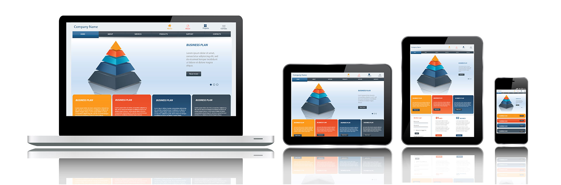
Responsive, Mobile Optimized Design

Many people searching for services are going to make their first encounter with your website on a mobile device. Your mobile website should easily communicate your value and allow easy navigation. Try a click-to-call prompt and measure the results!

Professional, Consistent Web Design

Your web design should provide a consistent professional feeling to potential clients. If your office provides a professional and friendly environment, front desk, and legal services – your website has to do the same.

UX – The Never Ending Process

Web technologies continue to evolve at an alarming rate. There will be new tools and methods a month from now. If you stay away from the bleeding edge and use data and testing to improve your website experience, you’re going to see conversion rates improve. UX is one of the best investments you can make in your business – from the search discovery experience, all the way to their first meeting with you, the attorney.

Dumping hundreds of thousands of dollars into advertising to double your leads is insanely expensive. You might double your conversion rate, with the same old traffic, by spending fifteen thousand dollars on: a new website, UX testing/improvements, and a front desk audit. Choosing UX over advertising can mean a much better return on investment. However, make sure you watch out for vendors peddling UX Myths!

Where are the statistics?

Legal is a tricky industry. There are such differences between practice areas and geographic locations. I had a hard time directly correlating numbers from B2C and B2B studies to the legal industry as a whole. Work with your agency and their reporting data to find your “low hanging fruit” and areas with room for improvement. Below are the various studies that I have read and used as references for this blog post. Reading List:

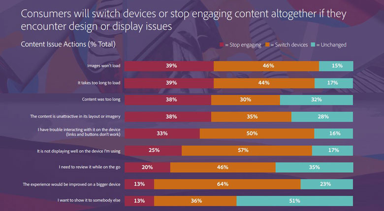
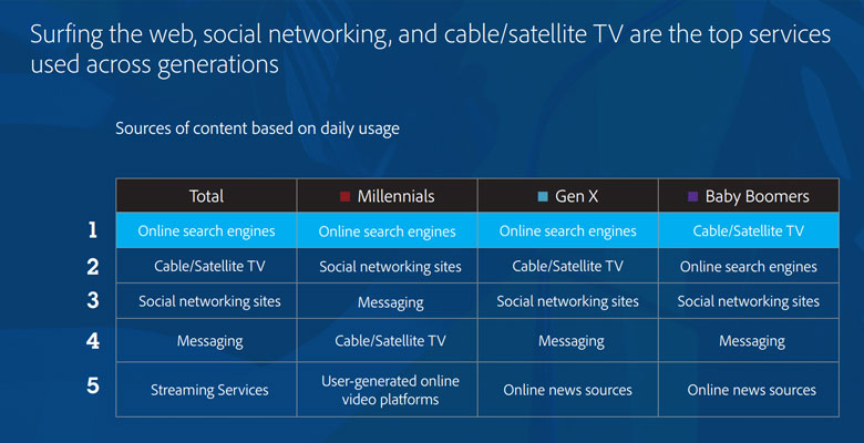
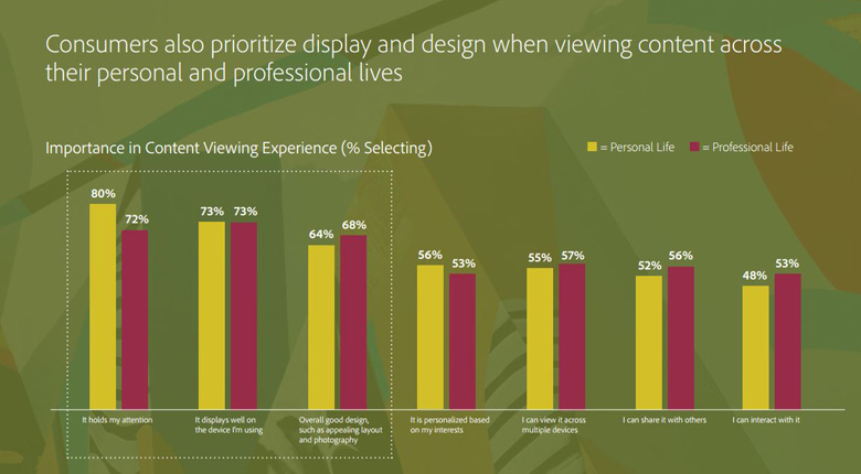
There’s a ton of data in there all pointing to the same thing – UX is one of the best investments a business can make if they’re marketing on the web. 

To push the point home, here are some pretty graphs. Directly correlated or not, they still offer important insights. Sources – Adobe and Ko Marketing (listed above).

Graphs Graphs Graphs

Annoying Buyers Graph

Content Issues Graph

Content Sources Table

Design Value Graph

The End, Or Is It?

Investing in UX improvements can drastically improve your conversion rates. UX isn’t a cheap fix, or something that is ever finished. It’s not a one and done process. You should have the basics covered if you have a newly designed website, but there’s always room for improvement supported by research and data.

Talk to your agency, talk to your clients, test your product, make improvements, grow your business!

“Responsive Websites” – What They Are and Why Your Business Needs One

Do you know what responsive websites are? Does your business already have one? If so, this post isn’t for you.

Do you keep hearing about the importance of responsive websites and mobile search? Not sure if your website is responsive? Don’t understand what responsive design means? This post is for you!

What Is Responsive Web Design?

Responsive Web Design is used to make your website look good and be easy to read/navigate – no matter what device your visitor is using. This means your website’s content/design/layout is going to change based on the screen size/orientation/resolution of the viewers screen. A responsive layout will ensure a good user experience across all devices. Your visitors won’t have to pinch zoom on their phones or have trouble navigating to the content they’re looking for.

If you only visit your website on one computer, you would never know if your website is responsive or not. Below is an example of a strong responsive layout. Notice how different layout elements shrink, move, and stack – depending on the device.

Responsive Websites

Not every responsive website is the same. There are many ways to implement responsive design on a website. They require adequate HTML architecture, CSS media queries, mobile navigation options, and much more.

I Love My Website, Why Does It Need to Be Responsive?

If you have an older static website design, it’s probably very difficult to use on mobile devices. Ever looked for a restaurant’s menu on their website from your phone? I bet you’ve found it very challenging to pinch zoom and navigate to one of their most important pieces of content. If your business website is not responsive, I guarantee that your visitors are having the same problem.

The Importance of Responsive Websites

Responsive websites are one of your biggest keys to more website traffic and conversions. The search engines know if your website is responsive and what it looks like on mobile devices. Google is simply more likely to serve up your website in mobile search results if it uses responsive design correctly.

It’s Official: Google Says More Searches Now On Mobile Than On Desktop

If your website isn’t mobile friendly, I would estimate your mobile traffic is around 10-25% of all your traffic. We’ve seen that number spike to around 40-50% once a responsive design is implemented. That change is due to a huge increase in mobile search traffic once a website has responsive design. With the increasing number of mobile devices on the market, more and more people are searching for local businesses with their phones and tablets.

How Can I Tell If My Website is Responsive?

The quickest way to tell, is to pull up your website on your desktop/laptop and your mobile device and see if the layout is different. This should be happening on every page of your website, ensuring all your content is mobile friendly. Try checking more than just your home page and see what happens.

The more important test is Google’s Mobile Friendly Test. Try entering your URL into this tester on a few pages of your website. If you don’t see something like this… Mobile Friendly Test Result
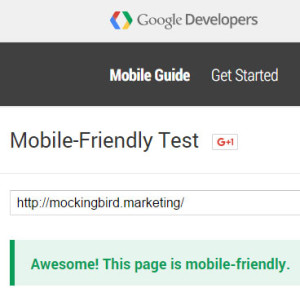
You should think about investing in responsive website redesign! You might also find some minor errors, like links that are too small. These kind of things can be easy for a web designer to change/fix and increase the mobile friendliness of your website.

What’s Next?

Google is working on a project called Accelerated Mobile Pages that will be rolling out in 2016. Their goal is to improve speed and quality of mobile websites and search results. From early examples, these pages look to be at the top of mobile search results. The earliest adopters will be major news outlets, but you can bet on this becoming and important feature for small businesses.

Automattic, the company founded by the WordPress platform founder, is already developing their AMP WordPress Plugin. This will allow WordPress sites an easier way to create Google’s Accelerated Mobile Pages. Once the benefits of these pages are clear, you can guarantee Mockingbird will be implementing this on all our sites.