Those working with WordPress/Yoast SEO will know title tags from setting up their homepage, but not much beyond that. Due to this, it can be easy to neglect title tags when building a website. This is a mistake, and I’ll tell you why.
What they are
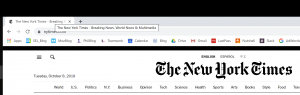
Title tags are incredibly important to SEO and page rankings by helping to communicate the purpose of the page in its code. HTML title tags are similar to page headlines but are often more to the point and describe the basic function of the page. A seen below, the page title for the New York Times is “The New York Times,” but the title tag (visible in the scroll-over text in the upper left-hand corner) is “The New York Times – Breaking News, World News & Multimedia.”
How they work
Title tags work by telling search engines the content of the page. This is how title tags can improve rankings: a well tagged page will make it easier for the search engine to connect users with the website. If the tags are relevant to the page, it will show up in relevant searches, even if none of the keywords from the page title are searched.
How to write them
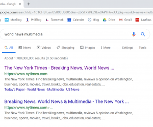
As previously stated, title tags need to be relevant to the content of the page, with specific enough keywords for search engines to be able to categorize them. This focus on keywords might make it tempting to cram your title tag full of any relevant word or phrase, but be warned: Google automatically trims long title tags. This can be seen above, where “The New York Times – Breaking News, World News & Multimedia” is cut into “The New York Times – Breaking News, World News …” If Google considers your tag too long or insufficiently informative, they will rewrite them. If your title tags are concise and informative, Google will probably leave them as you wrote them. In summary: you can make your title tags long if you want to, but Google might take over.
Recently I had a client cut me off mid-sentence with, “I’m going to stop you right there, I don’t care about that”.
I was in the middle of telling him why his current website did not meet WCAG guidelines and how we would fix this during redesign. We moved onto the next line item and I couldn’t stop thinking about why he should care. Everyone should care about making their site accessible.
Let’s say you are building your own store from the ground up. There are specific requirements that you need to meet so that your building is up to code. You want as many people to be able to enter your store as possible, right? The same thing goes for your website. Your website is your digital storefront and should want to make sure that everyone can interact with it.
According to W3.org, web accessibility is defined as:
Web accessibility means that websites, tools, and technologies are designed and developed so that people with disabilities can use them. More specifically, people can perceive, understand, navigate, and interact with the Web and contribute to the Web.
Here are some quick numbers for you. According to interactiveaccessibility.com with data from 2012:
• 56.7 Million Americans (18% of the population) have some type of disability
• An estimated 38.3 Million (12.6% of the population) have a severe disability
• 19.9 Million people (8.2% of the population) have difficulty lifting or grasping, making it difficult for them to use a mouse or keyboard.
• 15.2 Million people (6.3% of the population) have a cognitive, mental or emotional impairment
• 8.1 Million people (3.3% of the population) have a vision impairment and may need to rely on screen magnifiers or screen readers. They might also have some form of color blindness
• 7.6 Million (3.1% of the population) have a hearing impairment. Do the videos on your site have transcripts or captions?
There is a possibility that potential clients can’t utilize your site in some aspect, resulting in them leaving your site. Making your site accessible doesn’t only benefit users with disabilities either but making your site accessible to everyone no matter their situation. It means making your site accessible to users on mobile devices with smaller screens, elderly users with changing abilities, users who are impacted by “temporary disabilities” like a broken hand or people with “situational limitations” like being outside in bright light or in a waiting room where they can’t listen to audio.
Accessibility on the web is important and as a business owner, you should care about if your site is accessible or not.
We start every digital project with a discovery phase, which is an initial research period that will help provide structure during the design process. This research phase provides propose and direction to both us and the client when creating a digital solution. The discovery phase also helps identify potential roadblocks before we start designing or building a website and allows for more informed decisions throughout the cycle of the project. We don’t just want to build what a client asks us to build, we aim to build a successful product that aligns with the client’s business goals, appeals to their users, and helps them stand out from the competition.
How do we do this at Mockingbird? We break down the discovery phase into three categories.
Business Goals and Client Perceptions
Business Goals
Internal Perception
We start the conversation by finding out where the client falls within their current market and where they’d like to be headed. This requires an understanding of their current business goals, relative strengths and weaknesses, and competitive advantages within their industry or geographic area.
We have a client questionnaire that goes over internal perceptions to help identify any unique points that make a firm stand out and appeal to potential clients.
User Behavior and Customer Desires
Demographics
User Behavior Through Analytics
Next, we want to answer the question, “Who are we designing for?” We gather as much information, mostly by gathering analytics and running our own report, to define who the client’s current website users are and how can we appeal to them. No matter what field of practice, hiring an attorney is a fairly emotional ordeal. We want appeal to the right desires. We want to imagine the website from their perspective. In doing so, we can appeal to their emotions and make it as simple as possible to contact your firm.
Market Landscape and Opportunities
What Competitors Are Doing
Your Position Within the Market
Finally, we want to find the room for opportunity. What are competitors doing? Are they all doing the same thing? Is the client’s market saturated with law firm websites showcasing the same interchangeably well-tailored lawyers with crossed arms, touting their millions of dollars recovered? We don’t want our clients to blend into the crowd of attorneys, we want to show off how each firm is unique and prove they stand above the competition.
By taking a step back and looking at the entire landscape before starting any of the actual site mockups we’re able to take a more data driven approach to the design process. It’s not enough to build a website that loads fast and looks great. The true differentiator comes from creating a site that sets each client apart from their competitors, aligns with the emotional needs of their clients, and helps them achieve their firm’s business goals. The discovery phase is a key first step and helps build the foundation for each successful website.
Listen to Mockingbird’s Design Lead, Ryan Sprouse and Taft Stettinius & Hollister’s IP, IT and Data Security Partner, Jeff Kosc to get down and dirty about ADA Compliance for websites. This webinar showcases what it’s actually like to interact with the web while disabled, reviews Web Content Accessibility Guidelines (WCAG) and discuss the most current legal thinking and precedent regarding ADA Compliance lawsuits related to websites.
The main goal of a law firm’s website is to create a solution that meets their target audience’s needs and encourages conversions by getting visitors to contact the firm. Understanding your target audience and your firm’s business goals is the driving factor behind website content. We want to convey your firm’s narrative in a way that’s clear, concise, and emotionally appealing to potential clients. Below are key reasons why your firm should start every website project with a content first approach.
Tackling content first helps shape design and saves time.
Agreeing on content structure helps eliminate two major obstacles: creating new content to fit the design AND needing to edit old content to fit an updated design. Both of those events are avoidable if you create a design with content in mind. This can cut down on rounds of revisions where you may end up making small content changes and allows the designer to present your content visually in a way that appeals to the user’s emotions and conveys your firm’s story.
A solid content plan speeds up the workflow of the project.
Frequently, the biggest road block when creating a new website for a client is waiting for content. Establishing the structure and content needed before the design eliminates this obstacle so you don’t end up waiting on content decisions when the site is almost ready for launch. Developing a plan for content at the start of the project will help clarify who will be creating new content, when it needs to be created, and how that content is going to be structured before anything is designed. Instead of waiting in the middle of a project, we establish this up front for an optimal workflow.
A content first approach makes for a better user experience.
When the design is built around the content, the user has a consistent experience across the website. All practice areas look uniform and aren’t structured differently, location pages have all the necessary content for Google My Business and are displayed the same. We want the user to know they are on a location page or a contact page, not guess because one office’s content is displayed differently than another. Uniformity not only helps speed up the website because there’s less code, but when users navigate the site everything reinforces one uniform message about your firm. With a content first approach, we know what to display from mobile to desktop and how the content will scale in different views and sizes.
Content planning provides scalability and structure moving forward.
Often, content will be managed post launch by someone in your firm. Having the content structured and following an outline helps scale the website in consistency and design. Someone who wasn’t present during the design process can manage the content afterwards without missing a beat.
In short, a lot of the difficulties that pop up during the design and development process can be mitigated if you spend some time planning out what you want to convey with your website, and more specifically, what type of content you’re going to use to communicate that message.
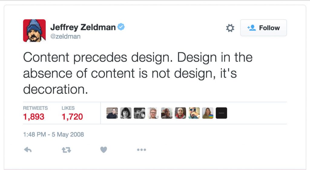
Quote from Jeffrey Zeldman, a legend in the web design world.
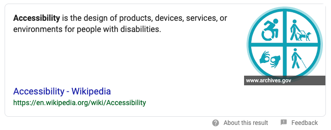
What does the word accessibility mean? A quick Google search on “Accessibility” yields a result from Wikipedia stating, “Accessibility is the design of products, devices, services, or environments for people with disabilities.”
Why Does It Matter?
The overall goal of web accessibility is to ensure that a website’s content and functionality is visible and can be operated by anyone. As a business owner you want to make sure that your website can be used by all of your potential clients. In order for you to reach the widest audience possible, your website has to be accessible.
What kinds of disabilities are we talking about?
Auditory
Cognitive
Neurological
Physical
Speech
Visual
Accessibility doesn’t always pertain to individuals who have disabilities. Web accessibility also includes:
Mobile devices, smart watches, smart TV’s, etc
Aging individuals
Individuals who are experiencing temporary disabilities like a broken arm
Individuals with situational limitations such as being outdoors where there is bright light or in a library where they cannot listen to audio
How to Ensure Your Website is Accessible:
Listed below are some simple steps you can check to see if your website is accessible on a basic level.
Page Titles:
Page titles are a short description of a webpage. They appear at the top of the browser as well as in the SERPs. They are used by screen readers as well as bookmarks and favorites. Make sure that you have a title that sufficiently describes the content on your webpage.
Alternative (alt) tags:
Alt tags are used to describe an image when an image fails to load. They are also used by screen readers for users who may not be able to see the image. You can check to see if an image has alt tags within your content management system. Make sure that all alt tags are descriptive and specific.
Headings:
Headings are important for the overall structure of the page. Headings are ranked from H1 to H6 with H1 being the most important. Headings are also crucial for people who cannot use a mouse. Headings provide structure for people to navigate through the webpage with a keyboard or a screen reader. Make sure all pages within your website has an <h1> level heading for the title of the page. For more information regarding headings and how to correctly use them, check out Yoast’s outline on how to use headings properly.
Contrast:
It is easy to overlook something as simple as color when it comes to accessibility. Color contrast is important to keep in mind when designing a website. People who have impaired vision may not be able to read content on your website if the colors don’t comply with the Web Content Accessibility Guidelines (WCAG). To check whether your website follows the WCAG guidelines, you can use a contrast checker.
Check Your Site
The simple steps above are just the tip of the iceberg when in comes to web accessibility. Use this outline to quickly check if your website meets some of the basic requirements for digital accessibility and be certain that your website can reach the widest audience possible.
To read more into web accessibility, check out any of the websites below.
Not all website redesigns are created equal. In many cases, updating a website is the obvious starting point for addressing technical issues, modernizing design and usability, or updating your brand. Done correctly, a new website should offer a boost to your overall business.
Key metrics to look at when assessing whether a new website is successful:
Site speed
Organic traffic
Usability
Conversions
Each of these metrics can be tackled by answering the questions below.
How do technical benchmarks compare against your previous site?
By analyzing site speed, on page scripts, image optimization, outdated plugins, and even the platform the site is hosted on, you can get a pretty accurate picture of whether the new website offers an improvement over what you had before.
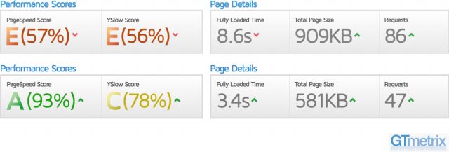
Ideally, your new website should only show improvements or equivalencies when it comes to technical benchmarks.
The dramatic improvement in site speed between old (above) and new (below) is one key indicator a recent redesign was a success.
Are more people finding the site organically?
Although it’s not uncommon to see a dip in traffic following the launch of a new website, one of the best indicators that things are going well in the search engines is an increase in organic traffic.
All pages you’re trying to drive traffic to should be indexed in Google (and the search engine also rans) and getting visitors. Post launch increases in organic traffic are a great indicator that smart decisions were made during the website redesign process.
Do potential clients find it easier to navigate?
You want your new site to be as easy to use as possible. Prospects shouldn’t be struggling to find information or get to the appropriate internal pages. Without using tools like Hotjar to monitor user sessions, the best way to gauge the performance of your new website is by comparing bounce rate, average page views, and time spent on site against the previous iteration.
If people are less likely to leave, looking at more of your content, and spending longer on your new website, that’s a great indicator that things are going well.
How do your conversion rates compare with the old site?
Even if traffic is up and people are spending more time interacting with your new site, it’s not a true win if they’re not requesting your services. By comparing the old site’s conversion rates against the new one you’ll get an accurate picture of the incremental improvement between the two.
Regardless of traffic, if a higher percentage of visitors are reaching out to learn more about whether your firm can help them, it’s a strong signal that your redesign improved your ability to generate new business.
Is it helping you achieve your business goals?
The ultimate goal of your redesign is to get more business. This can mean more clients, higher value clients, or even a shift in which portion of your practice you’re trying to prioritize. Although it’s not always directly tied to driving revenue, that’s definitely the most common goal.
Very few firms are effectively tracking marketing on a cost per client level, but even if it’s only being looked at on a cost-per-inquiry basis, reducing the cost you pay for each qualified lead shows the money you spend on a website redesign was an investment rather than an expense.
Summary
Website redesigns can be extremely expensive and failing to take a data driven approach is a great way to burn money and create massive frustration. Projects of this scope should be approached as an investment in your business and any good agency will work with you to measure the results of their work, continue to refine and improve post-launch, and push for decisions during the redesign process that will not just “look nice” but actually help your firm be more successful.
Security vulnerabilities are nothing new when it comes to tech. Every day, we are increasingly and often unknowingly putting ourselves at risk for digital intruders. Doorbells, hot tubs, baby monitors, Facebook, Google+ and yes, website hosting companies to name a few. The consequences include potential access to your accounts, sensitive information, or worse.
A recent report by Paulos Yibelo, an experienced security researcher, found that five popular web hosting companies were easily hacked by one or more means:
Bluehost
Dreamhost
HostGator
OVH
iPage
Paulos identified dozens of bugs that vary in severity and allow hackers access to sensitive information, full account takeovers or both.
Given the importance of security, it’s worth noting that the article says the vulnerabilities have been fixed. That said, it may be time to invest in a higher quality hosting company, especially if you use a popular content management system (CMS) like WordPress.
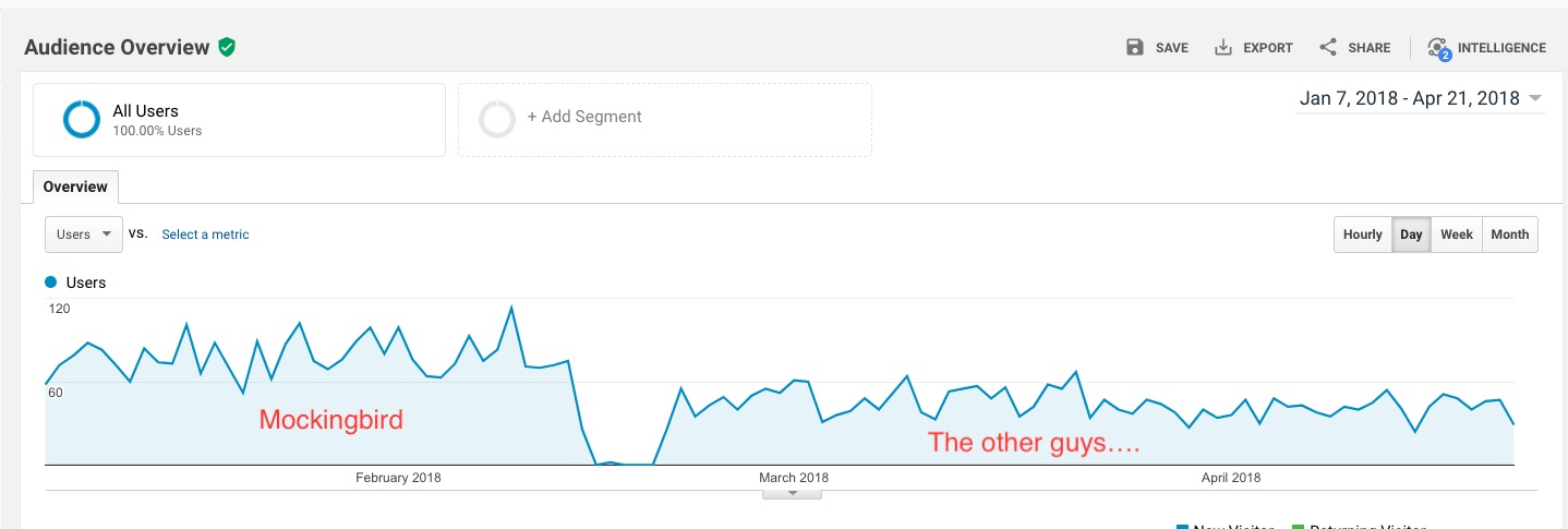
Sometimes our clients leave us. And it always makes me sad…especially when they move to a different provider, who insists on them paying for an “updated” website and locking them in for a multi year contract. Especially, when they were already on a very good, well built WordPress site. But it’s even worse, when this website redesign underperforms. Immediately and drastically. Our ex client, experienced this as a 44% decrease in website traffic that rolled out immediately after her new site launched. No new content, no changes in backlink profile, no changes to her local tactics or platform. Just a new website on a vendor’s proprietary platform, that frankly can’t compete with her, ahem, “old” (and in this case, the site was about 4 years old) WordPress site.
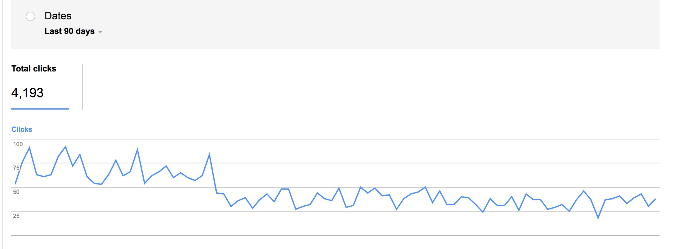
In the off chance that this was a random change in tracking infrastructure, we further validated the data above in Google Search Console – the results mirror the significant drop in search traffic – 44% in fact – once the law firm migrated away from WordPress.
Take this as yet another example of the value of a well coded WordPress website, which intrinsically outperforms proprietary platforms.
Now, not all WordPress sites are created equal – in fact many of the widely available and utilized templates are extremely poorly coded from an SEO perspective. (This is the part where I tangentially brag about our developers’ collective coding prowess.) And not all WordPress sites are fast – great hosting (in our case, WPEngine) is important – efficient code is important – expertly compressed imagery is important. In our case, we tend to obsess over those things. Now our ex client is seeing a 44% drop in her website traffic. And because she is heavily dependent on the web for client development, presumably a 44% decrease in business. And it’s a real shame if she’s locked in for a multi-year commitment. I’m not saying you have to work with us – just be aware that platform matters. I apologize if this comes across as bitter…and yes, there’s a little bitter taste in my mouth…but I hope you can avoid the same mistakes she made, even if it’s not with Mockingbird.