FindLaw WordPress Websites: A Cynical Middle Finger to Their Clients

FindLaw has a history of tying up their clients in contractual and technical knots, so I shouldn’t be surprised at their latest technical entanglement.

I’ve been quiet about FindLaw for a few years now. The tales of their dirty tricks have faded: registering domains to themselves, overpriced social media tools, data hijacking, the delightful linkselling scandal, and the abhorrently gross practice of having clients pay to SEO a site only to later resell that site to a competitor: FindLaw Selling Pre-SEO’d Websites. Years ago, in a fit of annoyance, I penned The FindLaw Jailbreak Guide and watched my website explode with traffic from Eagen, Minnesota.

The latest from FindLaw is likewise brazen, obnoxious and self serving. Business models predicated on entrapping clients make me retch. One of those previous tricks in the FindLaw arsenal that artificially tied customers to them, was the use of the proprietary website platform – a website built on a backend that no one other than FindLaw could work on. This made sites time consuming and expensive to maintain, as updates had to flow through FindLaw. It was also difficult to leave, despite the overpriced monthly charges, as sites needed to be rebuilt from scratch which is an expensive endeavor. Over the years, the legal industry finally caught on to these technical handcuffs, opting for the freedom of the widely utilized WordPress instead. And then, back in February of 2018 a little birdie whispered in my ear that FindLaw was moving to WordPress, leaving Scorpion as the only big box legal provider with a proprietary platform. I surmised in a blog post that FindLaw had to move as they were losing clients who preferred the freedom, flexibility and performance of the widely-adopted WordPress platform:

Having spoken to perhaps a hundred FindLaw clients in detail over the past decade, the long term, captive nature of the proprietary platform and contracts is something clients resent. No one wants to be beholden to a vendor, especially when cheaper, better alternatives exist. This has been, perhaps, the primary reason we’ve easily been able to score deals with FindLaw clients.

So three years ago, FindLaw finally evolved to a customer centric, WordPress based approach!  Hold the phone…

Fast forward to a 2021 and law firms are starting to age out of long term FindLaw contracts for their new WordPress website. Some have started looking for new vendors. Now generally, transitions of a website from one agency to another look like this: client uses their WordPress admin account to create a login. Hits send. It takes a solid 90 seconds, access to the Internet and the technical acumen of one of my pet chickens. In moments, the new agency or contractor or in-house marketer or precociously nerdy teenager of one of the partners can work on the legacy site. This simplicity of transferability firmly puts the law firm in control of their site (instead of their vendor) and is one of the prime reasons why WordPress is superior to proprietary platforms.

But not with FindLaw’s WordPress sites, which have been pompously, cynically and deliberately designed to make the transition process painful, expensive and time consuming. Once law firm clients decide they’ve had enough and want to move on, FindLaw’s “don’t let the door hit you on the way out” is best embodied in a FindLaw document entitled “Importing FindLaw WordPress Files How-To Guide” which goes to great pains to demonstrate just how annoying, painful, time-consuming, technical and expensive the transition process is going to be. (And I’ll bet you a bottle of scotch, FindLaw sales staff doesn’t share this file when they are peddling websites through cold calling outreach.)

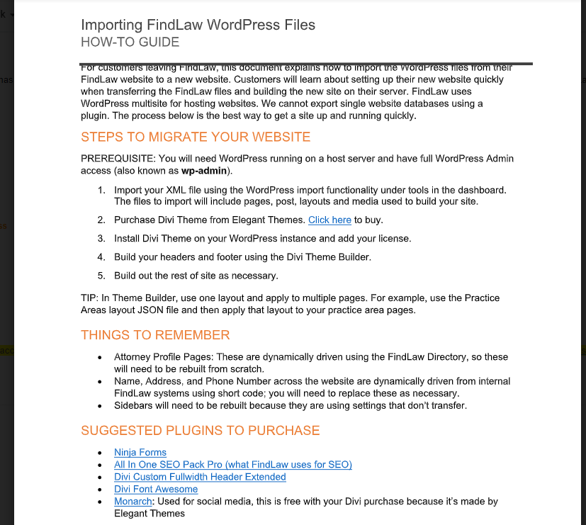
Let’s dig into some of the specifics:

  • Expenditures – Customers are directed to purchase 6 different themes and plug-ins in order to make their ex-FindLaw WordPress site functional.
  • Content – Much of the content on FindLaw WordPress sites is syndicated directly from the FindLaw directory including the lawyer profile. “Attorney Profile Pages are dynamically driven using the FindLaw Directory, so these will need to be created from scratch.” Beyond the annoyance of rebuilding a standard page type, take a moment to consider the SEO implications of this tactic. FindLaw syndicates content from their own directory to their clients’ website causing a massive duplicate content problem and SEO conflict with themselves vs. their clients on arguably the firm’s most valuable, the Attorney Profile Page.
  • Technical Talk – not scared off yet?  Try this on for size for the average J.D. “In Theme Builder, use one layout and apply to multiple pages. For example, use the Practice Areas layout JSON file and then apply that layout to your practice area page.”  How about, “Sidebars will need to be rebuilt because they are using settings that don’t transfer.”  And my favorite is #5 in the Steps to Migrate Your Website process: “Build out the rest of site as necessary.”  Still feel like you can “get a site up and running quickly”?
  • Divi Builder – This will be lost on almost all lawyers, but Divi-Builder is widely panned among high end developers, especially when compared to the robustness and cleanliness of other available themes. Divi is built for non-technical beginners who want to customize design without needing to code, instead of experts who want full clean control. A comparative of Divi vs. Elementor page builder sums it up: “Get Divi if you are a solopreneur with 1 Website“. And while this may describe many lawyers, it is certainly not what to expect when buying from an established vendor. The fact that FindLaw use the coding equivalent of paint-by-numbers for their WordPress platform is a huge red flag.
  • Sardonic Irony – “Customers will learn about setting up their new website quickly when transferring the FindLaw files and building the new site on their server… the process below is the best way to get a site up and running quickly.” Those are my emphases, but I can’t help but be gripped by the intentional sardonic irony of the author who knows damn well that  “building the new site” isn’t “quick”; especially when considering the alternative of just handing over log-ins to a WordPress site – like every other reasonable agency in the world does.

Under the guise of being a helpful how-to, this document is actually a warning shot regarding the cost, the pain and the forthcoming nightmare for an attorney leaving their Findlaw website; an MBA’s most pathetic, craven approach to customer retention.

Costs of “Migrating” a FindLaw WordPress Website

So what does this mean for a law firm leaving FindLaw for a new agency? Noting that Mockingbird is not necessarily the cheapest alternative, there are basically three options:

  1. Rebuild the site per FindLaw How-To Directives. I asked my web dev team to estimate costs for rebuilding the site to the existing look and feel and functionality of the FindLaw site while following the How-To Guide. These costs include third party expenditures, coding time to”build” the site and pre-launch testing protocol – rough estimate of $6-$11K. This, for a very very rudimentary, cookie-cutter site with generic design.
  2. Replace the FindLaw Template with our Echo Template. Many of our smaller clients use our simple WordPress template called Echo, which enables us to get sites up very quickly and at low cost. Say goodbye to the divi theme. Echo is a modular, fast, cost-effective template and costs $200/month. (For only 24 months – I don’t believe in that gross practice of the perpetual ongoing monthly drip out of your bank account – yet another example of scheming MBA’s putting business models ahead of their customers.)
  3. Genuinely Customized Site – If we are rebuilding from scratch, what would a fully bespoke site look like?  Cost estimates range from $12-$30K depending on our starting point, the complexity and age of the legacy code, content map, design customizations etc. In this case, I wouldn’t recommend this third option as the firm in question is small and should spend more of their budget driving traffic to a good-enough website instead of optimizing conversion with custom design for a site already getting a large volume of traffic.
  4. Stay with FindLaw

Don’t forget, since we started in 2013, the total amount Mockingbird has charged clients for switching to us from another agency running a WordPress site is: $0.

When FindLaw moved to the widely adopted WordPress platform, they went out of their way to use technology to systemically ensnare their customers. Their explanation “FindLaw uses WordPress multisite for hosting websites. We cannot export single website databases…” exposes their true intention. They deliberately selected a technology platform that, just like the old, inefficient proprietary code, makes the switching costs high enough that a few miserable attorneys won’t leave. I’m left with this thought – if FindLaw had spent the same amount of effort building an amazing product as they did in entrapping their clients with technology, perhaps their clients wouldn’t be so eager to leave.

Smart Lawyers don’t hire agencies that trap them. 


Mockingbird Prepares for Google Web Vitals

In a previous post, we covered Google announcing Core Web Vitals as metrics to measure a healthy site. In November, they announced that these metrics will be search engine ranking signals in May 2021 along with existing search signals for page experience which include mobile-friendliness, safe-browsing, HTTPS, and intrusive interstitial guidelines. We have been spending time diving into these web vitals and how we can be prepared and provide an excellent page experience.

To review, these are defined as the Core Web Vitals:

  • Largest Contentful Paint (LCP): The time it takes for a page’s main content to load. An ideal LCP measurement is 2.5 seconds or faster.
  • First Input Delay (FID): The time it takes for a page to become interactive. An ideal measurement is less than 100 ms.
  • Cumulative Layout Shift (CLS): The amount of unexpected layout shift of visual page content. An ideal measurement is less than 0.1.

Let’s dive into how Mockingbird is preparing.

  • Using Sage 10 starter theme that comes prepared to use tools that help purge, minify, and cache the theme assets we make. This is important for site speed and most importantly, first input delay. We combine and concat our JavaScript and CSS files down to bare minimum to make them extra lean.
  • Using CSS to fill in spacing for fixed elements. Often websites have fixed elements (we have fixed headers that react to user scroll) like banners or ads. If you don’t accommodate for that space before the element loads, it will shift the website layout when the rest of the website doesn’t, thus increasing your CLS score which we don’t want.
  • Using WebP images – a more progressive web format that can be compressed smaller than your typical image formats.
  • WordPress now comes with lazy loading which means it doesn’t load page elements into view until the content is within the viewport.
  • Removing useless JavaScript like light-boxes and carousels. JavaScript is a huge offender in page load and the less JavaScript, the better.
  • Using Autoptimize to load combined third party Javascript and CSS files into one bundle. This drastically helps with site speed and decreasing FID.

The Results

Below are screenshots of some recent law firm websites we have created using the above techniques.

Law Firm Website Marketing Website Metrics for personal injury attorney

Rochester Law Firm Website Metrics

Long Island law Firm Website Metrics

Laws of UX Series: Miller’s Law, Peak-End Rule, and the Serial Position Effect.

Laws of UX are a collection of design heuristics created by Jon Yablonski to help designers leverage psychology to create more human-centered experiences. You can find explanations for each law on the website lawsofux.com, as well as an in-depth case study regarding his thought process on his website, jonyablonski.com

This will be a series of blog posts briefly covering the many laws and how they can help designers create better experiences for law firms.


Millers Law1) Miller’s Law

“The average person can only keep 7 (plus or minus 2) items in their working memory.”

Milller’s Law is named after George Miller, a cognitive psychologist who believed that the average number of objects the average human can hold in working memory is seven (plus or minus two).

Miller’s law suggest we use “chunking” in order to organize content in a way that will help users process and understand content easily. Chunking, meaning short “chunks” of information that users can read and scan quickly.

If your website consists of massive walls of content, it might be worth rewriting into grouped, shorter content that is easier to consume. Here are some guidelines to follow that will help you follow Miller’s Law and create content that is easier for your users to consume.

  1. Use bullet-points and easy to read headings.
  2. Try to keep text lines around 50-75 characters.
  3. Use clear visual hiarchy and group related items together


Peak-End Rule Poster2) Peak-End Rule

“People judge an experience largely based on how they felt at its peak and at its end, rather than the total sum or average of every moment of the experience.”

Think back to a particular memory. It could be your first concert, a holiday from your childhood or a family vacation. The memory that you recall is created from how you felt during its peak moments and how it ended. This is because users focus on the most intense points of an experience and the final moments.

This is important when thinking about your firm. Whether it’s your website, your intake or how you conduct yourself with your clients, people will only recall the most intense points and the final moments that they experienced with you. It is also important to point out that people recall negative experiences more instensly than positive ones.

Focus on the moments that your service has been the most helpful, or areas where you feel you excel the most and make them better.


Serial Position Effect3) Serial Position Effect

“Users have a propensity to best remember the first and last items in a series.”

The Serial Position Effect describes how the position of an item in a sequence affects how users recall them. You can find this being put to work in many website navigations. The items within the navigation that are most important are almost always on the far left and the far right (home being far left and contact being far right). This isn’t always the case, especially when designers feel the need to remove the navigation on desktop and opt for a hamburger menu (hint: don’t do that).

In order to minimize strain for your users, try to limit the number of options you have in your navigation, practice area cards, etc. In most cases, more is not necessarily better.


Google Introduces Core Web Vitals

In early May, Google announced they would be tracking user experience by the creation of three new web vitals or as they say, “essential metrics for a healthy site.” In the beginning of July, google had its annual web dev live conference where the first day was majority focused on explaining these new vitals and how to optimize these vitals. Measuring user experience will always be a moving target and Google has stated that they will be reviewing web vitals annually during their I/O conference. I will cover what these web vitals are and some overview learning of watching videos form the conference.

Overview of the New Core Web Vitals

Largest Contentful Paint (LCP)

LCP measures loading and speed by marking when the largest (usually primary content) is loaded into the viewport. A great example of this would be a hero image often found on websites. Your target goal of LCP should be 2.5seconds or less when the page first starts loading. Google explains LCP more in depth.

Common Issues Affecting LCP

  • Slow server response times
    • Cheap hosting
    • Terrible server side coding
    • Unoptimized database queries
  • Render blocking JS/CSS – Before website loads content, it has to parse HTML page. CSS and JS files by default block the rending of this page till they are loaded.
  • Slow resource times
    • Unoptimized images – usually the main culprit
    • Loading videos
  • Client-side rendering – using JavaScript to dynamically load content like API calls and not optimizing or caching the calls.

You can learn to optimize for LCP from Google.

First Input Delay (FID)

FPD measures your sites interactivity and responsiveness by measuring how long it takes for a user to interact with your page as it loads. It measures the delay of your web page being unresponsive to the user. Goal is to have a FPD of 100 milliseconds or less. Google explains FID more in depth.

JavaScript Biggest Offender

The greatest impact of FID come from JavaScript. Javascript blocks the webpage from loading until it’s executed, it’s known as “render blocking.” For internal JavaScript files, it’s best to optimize and chunk your Javascript code. Third party scripts affect your site’s loading speed too.

You can learn more in depth ways to optimize FID from Google.

Cumulative Layout Shift (CLS)

CLS measures visual stability by quantifying any unexpected layout shifts of visible web content. Think of when a page loads and you start reading an article, then an image loads in and pushes the paragraph down or a website banner load sin late and shows the entire web page lower, both of these are examples of CLS. CLS is calculated by impact fraction * distance fraction.

Common Issues Affecting CLS

  • Images without dimensions – always include width and height attribute on media elements such as images or videos
  • Ads, embeds, iframes, etc, without dimensions
  • Dynamically loaded content (often from APIs) – don’t forget to save some allotted space for any content being loaded dynamically. Avoid loading new content above existing content, unless triggered by a user interaction like a load more button.
  • Web fonts causing FOIT(Flash of Invisible Text)/FOUT(Flash of unsettled text)

You can learn more in depth ways to optimize CLS from Google.

Measuring Web Vitals

Along with the announcement of these new core web vitals came some new tooling and updated to existing tools. Google measures these three metrics with two types of data. Lab data is artificial interactions used to track down errors and bugs. Field Data is real world users and how they are interacting with your site. If 75% of the page views meet the good threshold for each measurement, then the website is classified as having a good performance for that metric. First let’s explain Lighthouse, the main technology powering these tools.

Lighthouse: the Underlying Technology

Google uses Lighthouse, a website auditing tool that powers different tools to measure these vitals. Lighthouse 6.0 has been released with reporting on the three new core web vital metrics. The web core vitals: Largest Contentful Paint, Cumlative Layoutshift, and Total Blocking Time (Lab data to simulate First Input Delay) are now added into the scoring system. The performance scoring system is broken down below.

Weight % Audit
15 First Contentful Paint (FCP)
15 Speed Index
25 Largest Contentful Paint (LCP)
15 Time to Interactive (TTI)
25 Total Blocking Time (TbT)
5 Cumlative Layout Shift (CLS)

Tools Provided to Measure your Website

  • Pagespeed Insights – a tool that has been around for a long time and shouldn’t be new to anyone working with websites. What is new is leverages Lighthouse to measure core vitals. Great for finding and diagnosing easily replicable errors.
  • Chrome UX Report (CrUX) – uses real users for data and be setup using Data Studio or BigQuery to create reports. Developers can also leverage the CrUX API to pull in JSON data and visualize it how they’d like.
  • Search Console – has a new web vitals report built in based on real user data. Awesome for a constant monitoring tool your live website and uses real world data.
  • Chrome Dev Tools – had some new features implemented into the performance tab to measure core web vitals. You can also perform lighthouse audits direct int he Chrome dev tools as well. You can learn more from the web dev live video. Very useful for local debugging.
  • Web vital extension – you know Google had to create a Chrome extension.
  • Site Kit from Google – a WordPress Plugin from Google that connects to Google services and displays an overview in your WP dashboard.

Laws of UX Series: Law of Proximity, Law of Similarity and the Law of Uniform Connectedness.

Laws of UX are a collection of design heuristics created by Jon Yablonski to help designers leverage psychology to create more human-centered experiences. You can find explanations for each law on the website lawsofux.com, as well as an in-depth case study regarding his thought process on his website, jonyablonski.com

This will be a series of blog posts briefly covering the many laws and how they can help designers create better experiences for law firms.


Law of Proximity1) Law of Proximity

“Objects that are near, or proximate to each other, tend to be grouped together.”

The Law of Proximity defines how the human eyes with how our eye and brain form connections with visual elements. Elements that are close together are perceived as a group and related to each other. Elements that have space between them establish a disconnect and are not related.

For example, paragraphs in a book or blog post follow the Law of Proximity by grouping specific sections of text together to form similar ideas. Also, take our contact form in our footer for example. By placing the contact information and form fields within the boundary of a box,  we have established that everything within that element is related to each other and focuses on one specific function.


Law of Similarity2) Law of Similarity

“The human eye tends to perceive similar elements in a design as a complete picture, shape, or group, even if those elements are separated.”

The Law of Similarity is similar (heh heh) to the Law of Proximity. While the Law of Proximity states that elements that are close together are perceived as a unified group, the Law of Similarity states that elements that are similar to each other are perceived as a unified group, even if they are not grouped together. Similarity can be defined as shape, color, size, orientation, etc.


3) Law of Uniform Connectedness

“Elements that are visually connected are perceived as more related than elements with no connection.”

The Law of Uniform Connectedness states that elements connected by uniform visual properties are perceived as a unified group more than elements that are not connected. Similar to the Law of Proximity, if a group of identical circles is enclosed in a box OR connected by a line, they are more closely related than the other circles that are outside of the box or not connected by a line.


Stay tuned for the next post in this series where I go over Miller’s Law, Peak-End Rule, and the Serial Position Effect.

Mockingbird’s Approach to Building Websites

We are going to go over the tools and techniques used to make Mockingbird custom websites and how it helps us achieve our technical metrics and goals. We are constantly researching and trying to improve our build process. As more techniques and tools come out, we start learning how to incorporate them into our process.

What are our goals?

  1. Site Speed – we aim for all websites to load 3s or below (without third party scripts)
  2. Accessibility – We clear the AA Level of the Web Content Accessibility Guidelines
  3. Sexy and clean – sometimes, clients decide to leave us. When they do, we want to make sure whoever takes a look under the hood of the theme can easily do what they need to do.

What theme are we using?

  1. Sage 9 Theme – The sage theme comes with a lot of tools baked in for advanced WordPress development.
    • Blade Templating Engine – stay DRY (don’t repeat yourself) by using Blade templates which makes it easy to organize code so developers can quickly find what they need and prevent unneeded code bloat.
    • Webpack – we can write JavaScript and SASS that can be easily compiled, minified, and concatenated to reduce the size of the theme.
    • JavaScript Routing – combined with Webpack, we can dynamically load JS files on different pages to reduce load size on each page.
    • Automatically optimize theme images – all image files within the theme get compressed and minified for production.
  2. Tailwind CSS – the never ending debate of CSS structure and conventions can be tiresome. After some long consideration, we landed on tailwind, which is a utility first approach to writing CSS.
    • We don’t have to think of clever names for classes
    • Easier to scale vs other methodologies where you can easily repeat yourself such as adding borders or shadows to elements.
  3. Blade SVG – a way to easily incorporate SVG files into the website.
  4. Purge CSS – we configure a script to run throughout the site to purge all the extra CSS classes that aren’t being used, therefor reducing the file size.
  5. Lazyloading – we have created a custom implementation to enable lazy loading so pictures only load when they are needed.
  6. WP-CLI – installed on our local environments and hosting to easily manage things or run scripts on our projects.

What plugins do we use?

  1. Soil – cleans up all the extra junk WP likes to add to websites when rendering.
  2. Advanced Custom Fields – this is the only way to easily extend your WordPress customization.
  3. Query Monitor – used during development only so we can watch our calls to the database and see anything that is being resource intensive.

What tools are used in QA?

We want to measure how we are doing with everything above so we use a few different tools to measure.

  1. Wave – an accessibility website or extension that scans your pages and displays any accessibility issues.
  2. GTMetrix – a website speed analysts tool
  3. Google Lighthouse/Devtools – another tool that rates your website on site, speed, and accessibility.

Sitemaps: What are They and Why Do I Need One?

There are a lot of features on websites you really don’t think about as a user until you get a peek behind the scenes. Sitemaps are one of these features. Whether they’re HTML sitemaps or XML site maps, there are conflicting ideas on whether or not they’re actually necessary. So let’s go into the benefits of having a sitemap.


So what is a sitemap?

A sitemap is a page on a website that contains links to every other page on the website. See, here’s ours. It’s usually designed for crawlers and search engines, which I’ll get back to. It’s pretty much what it says on the tin: a map of the site. It’s a one-stop-shop to get to all the other pages.


So what are the benefits of a sitemap?

There are many benefits to a sitemap, but the main ones fit into the groups of ease for search engines, ease for users, and organization. 


Ease for search engines

For the new kids in class, search engines like Google know which pages to show searchers by looking at millions of websites. They utilize spiders (a tool that follows links and builds a web of links from the connections its found) to understand how everything on the site links to each other. They can do this by simply following internal linking structures, but have a better time when they can go through one page. Hence the sitemap. Crawlers can go directly through the sitemap to every page, saving time and resources. 


This would probably be a good time to touch on the differences between HTML sitemaps and XML sitemaps. XML sitemaps are designed solely for search engines. Humans don’t get to see much of it. HTML sitemaps are usually easy to find on a website; ours is linked to in our footer. You can see where all of our pages are and even find links to every single one of our blog posts. Every. Single. One.


Ease for users

The user-oriented sitemap is extremely useful for finding pages that might be hidden in layers of internal linking. If you remember the name of one of our blog posts, you are just a click and Ctrl+F away from finding it. It sure beats scrolling back months or years to find it. 


Organization

Even nice websites can be sloppily organized. It happens. But a sitemap can help to visualize and show you where you might be able to correct linking structures. If your service pages are organized by type of service, but their URL structures don’t reflect that, your site might have an organization problem. A sitemap will show you how your pages are currently set up, and you can decide whether or not you want to fix that yourself.


Downsides of a sitemap

To be honest, there aren’t really any other than it takes time (not even a lot of time) to build it. It’s generally just a good practice to have a sitemap, even if it isn’t necessary


Creating a Sitemap

We actually have a blog post about how to create an HTML sitemap, so that’s a good resource for that. As for creating a user-oriented sitemap, there are numerous WordPress plugins for this very purpose. If you would like more information on building a sitemap for your law firm’s website, contact a company that has experience in this area.

Laws of UX Series: Aesthetic Usability Effect, Doherty Threshold and Fitts’s Law

Laws of UX are a collection of design heuristics created by Jon Yablonski to help designers leverage psychology to create more human-centered experiences. You can find explanations for each law on the website lawsofux.com, as well as an in-depth case study regarding his thought process on his website, jonyablonski.com

This will be a series of blog posts briefly covering the many laws and how they can help designers create better experiences for law firms.


UX Law Poster1) Aesthetic Usability Effect

“Users often perceive aesthetically pleasing design as design that’s more usable.”

Users tend to assume that things that look better will work better, even if they aren’t actually more productive. Users who visit your website may have a positive emotional response to the visual design of your website, making them more tolerant of minor usability issues while using your site. When I say “minor usability issues” I mean text with low contrast, spelling errors, or typography that isn’t consistent. The Aesthetic Usability Effect does have its limits and when the design puts aesthetics over usability, users will lose patience and leave your site.

For example, I have seen law firm websites that include huge hero images on practice area pages that cover the entire screen without including any information until moving down the page. The page may look appealing at first with a large, beautiful image at the top, however, the image that is taking up the entire screen may be seen as an annoyance once they are trying to complete specific tasks.


2) Doherty Threshold

“Productivity soars when a computer and its users interact at a pace (<400ms) that ensures that neither has to wait on the other.”

Fast websites are fun to use. Laggy, slow response websites suck. The longer it takes for your website to respond to a request, the longer your user is taking to think of what they want to do next. If you keep your users waiting, they will find what they are looking for on another law firm’s site. As a general rule, you want to provide feedback to a user’s request within 400ms in order to keep their attention.

If your website has any loading screens that aren’t imperative to the functionality of the site, fancy page transitions, or anything else that may slow down their experience with your site, you are doing more harm than good with those “cool” features.


3) Fitts’s Law

“The time to acquire a target is a function of the distance to and size of the target.”

A touch target is an area that responds to user input. Make sure that all touch targets are large enough for users to understand their functionality and easily accessible for users to interact with.

Many law firm websites (and websites in general) have touch targets that aren’t clearly visible or are located in hard to reach places from where a users finger can reach(looking at you hamburger menus located at the top left or right on mobile screens). Make sure any touch target on your website is easily recognizable and accessible to avoid confusing your users.


Stay tuned for the next post in this series where I go over Hick’s Law, Jakob’s Law and the Law of Common Region.

How to Get The Most Out of Your Blog

Maintaining a blog can feel like a fruitless chore, believe me, I get it. You can add and add to it and see no returns on 95 percent of your blog posts. So how can you turn it around and how can you know if it’s even worth it to keep going?


Breaking Out of the Spiral of Dis-Content

If you feel like your blog is going nowhere, chances are you don’t have a clear idea of where it’s supposed to go. Without a goal in mind it’s impossible to write functional content.

Your first step is deciding what type of audience you’re writing for, and what part of that audience you want to become clients. Write about what they want to know and, more importantly, what they need to know.  This will help you figure out where your blog is going and will hopefully inspire some interesting posts that drive traffic.


Linking to Your Practice

One of the important things to remember about your blog is that it doesn’t have to be directly related to your practice area. You can write about a specific subsection of the law that you find particularly interesting. This will help you stay interested in it while also starting to rank for those long-tail keywords. 

Once you’ve figured out your focus, you can try to find places where it might link to your firm as a whole. Think of where it overlaps with your practice areas. This will help traffic flow to the rest of your site and into your firm.


Find a Schedule That Works for You

Daily blogs can honestly be a bit excessive. Annual blogs are a bit sparse. Try to find a schedule that makes sense given your bandwidth and list of ideas. This might mean once a week, twice a month, once a month, or any period. 

Once you have found a cycle that works for you be sure not to get married to it. If a current news story is incredibly relevant to your practice or your blog, write a surprise post. Staying flexible will be your friend.


Guest Post

As far as publicity and link building goes, not much works better than guest-blogging. If you can write a post for a well-known publication, or get a well-known author write a post for you, you are building the authority of both you and your blog.


Stop the Blog if it Isn’t Working

Not all law firms need blogs. They aren’t a requirement for your bar membership and if no one’s reading it, it’s just costing time. Try to take steps to improve it, but if it still isn’t driving any traffic after a year or 18 months, don’t feel bad for abandoning it. You can pick it up again at any point if you feel the desire, but don’t feel bad for not doing that.


If you are worried about your blog and feel like your content could be improved, consider our content development plan. Mockingbird can help you audit your blog, cut what’s slowing your site down, and make a plan for building on what you need. Contact us to learn more.