Why Optimizing for Mobile is Necessary for Law Firms

Mobile users are a growing segment of all internet traffic. Between 10-50% of traffic going to legal websites being from a mobile device, with some dependence on practice area. That’s a large audience that you don’t want to turn away with poor web design.


Why Law Firms

Law firm websites provide vital resources for people in crisis when they might not be able to reach their computer. This means that all aspects of the website need to be optimized, not just the home page. Blogs, FAQs, and any other resources need to be easy to access and fast-loading, and contact info should be on every page. You want to make it as easy as possible for a consumer to find your resources, get the info they need, and call you to schedule a consultation.


Why Optimize

There are a few different ways to set up your website, and not all of them work for mobile. Some websites are designed solely for desktop, so when a consumer visits the site from their phone it looks exactly the same as the desktop version. This doesn’t work because the differences between the dimensions and user interfaces of a desktop and phone are completely different. Navigating a desktop-designed website from a phone is difficult and slow, and users are just as likely to go find a different website and a different law firm.


Why Google Cares

One final, extremely important reason to optimize for mobile is Google’s Mobile-First Indexing (MFI). Beginning in 2016, Google started indexing mobile versions of websites as their primary version. That means that if a website’s mobile version is slow, it’s page rank will be affected. If the content isn’t the same, Google will take the content on the mobile version as the primary version. When a website has a terrible mobile user experience, it’s page rank will likely be affected.


What You Can Do

Make sure your website is optimized. Ensure the images are scalable and the text is legible. If you have an old website, you might want to consider getting a new one. If your website needs maintenance, invest in it. If you need help with any of that, contact Mockingbird.

Legal Connect with Google Workshop – Two October Events

We’re happy to announce not one, but two Legal Connect with Google events for October.

This is a free, day-long, hands-on Workshop specifically designed to assist lawyers in evaluating their online marketing effectiveness.  Classes are focused on local, natural and paid search and are taught by Google employees and Mockingbird founder, Conrad Saam.

So if you wanted to attend the pilot event this week at Google HQ in Mountainview, but were unable to, there’s now a second and third chance.

Victoria Fabiano, Google Strategic Partner Manager

Dates and Venues

October 7 and 8 in New Orleans.   Details and Sign Up

October 17th in Google’s New York City Office.  Details and Sign Up

Workshop Description

During this intensive Workshop, experts from Google and Mockingbird guide attendees through a 12 page worksheet to evaluate the efficacy of their current online marketing efforts, with an eye towards identifying specific weaknesses or missed tactics. This is NOT a conference with talking heads delivering thinly veiled sales pitches from sponsored powerpoints, but instead a hands-on, interactive education, empowering attendees with actionable tools & tactics.

This is a HANDS ON workshop, you will need a laptop and access to your Google Analytics, Webmaster Tools and AdWords accounts, as well as your firm’s website CMS.

Elizabeth Olinger, Google Account Manager

The Agenda

  • 8:30am-9:00am | Registration & Continental Breakfast
  • 9:00am-9:15am | Kick off & Welcome
  • 9:15am-10:00am | The Online Legal Marketplace
  • 10:00am-11:00am | Google Analytics & Business Metrics
  • 11:00am-11:15am | Break
  • 11:15am-12:15pm | Search – Organic
  • 12:15pm-1:15pm | Networking Lunch
  • 1:15pm-2:15pm | Search Local + Advanced Linkbuilding
  • 2:15pm-3:15pm | Search Paid


Google SEO Penalty for Chat Pop-ups Coming?

Ichat penalty‘ve long ranted against many of the implementations of chat conversions – especially on mobile devices – in which the chat is so aggressive that it covers up content, as well as all other forms of conversion – phone numbers and form fills.  In most cases, chat implementations are configured to maximize revenue for the chat provider, NOT the law firm.  Some providers have gone so far to refuse to allow customization of how aggressively their chat is implemented.  This is further exacerbated by most vendors positioning their service as a marketing channel instead of what it truly is – a conversion channel.  (i.e. just because someone ultimately converted through chat – the marketing cost for that user should still be attributed to SEO, Adwords, Avvo etc.)
This is even worse on mobile implementations – with both limited screen size and a (very) high converting device (a phone) being overruled by the obnoxious chat box.

Don’t get me wrong, chat works – just pick your vendor very very carefully.

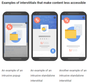
But that may all change on January 10th.  Google has announced a penalty on sites implementing intrusive interstitials (those annoying pop up chat boxes would fall into this category). While chat isn’t specifically called out, the announcement does describe the concerns; including interstitials that cover the main content as they “provide a poorer experience to users than other pages where content is immediately accessible”.  Google very specifically calls this out as a SEO penalty for mobile – those types of pages “may not rank as highly”.

While Google has said “responsible interstitials” may remain – based on their description, I read the tealeaves as meaning chat pop ups that very quickly and aggressive cover content and all other forms of conversion most likely will incur an SEO penalty for mobile based searches.

4 Google AdWords Tips You Should Implement Right Now

Mockingbird is one of the newest members in the Google’s Partner Acceleration Program (humble bragging found here). With this exciting new partnership comes exclusive training from Google’s AdWords specialists themselves. During our recent training at Google’s offices, one thing was stressed over and over: MOBILE IS IMPORTANT.

I could tell you that people check their phone over 100 times a day, or that 66% of people turn to their smartphone to look up something they saw on TV, but really all you need to know is that more people are using their phones to research and make purchase decisions than ever before.

Below are some tangible, actionable tips that you can apply in your AdWords campaigns today to help capture that growing number of mobile searchers.

1) Take advantage of new expanded text ads for mobile

Why you should use them:

  1. Longer ad titles. You now get two headline fields (up to 30 characters each) instead of one headline with a 25 character limit.
  2. Longer, more readable ad descriptions. You now get one field (up to 80 characters) instead of two fields with 35 character limits.
  3. A display URL that uses your final URL’s domain
  4. Two optional ”Path” fields in the ad’s display URL (up to 15 characters each). This means you can now change your ugly URLs to something more targeted.

Most importantly, you should begin using expanded text ads because starting October 26th, 2016, AdWords will no longer give you the option to create/edit standard ads. You might as well embrace the change and get used to the new format now.

More info from the Big G here.

2) Use locations extensions

There are many boons to showing your location directly in your ad:

  1. Potential clients generally want to hire legal counsel close to them; you can show users your physical address to help with the decision process.
  2. Location extensions help your ad take up more real estate in the SERP (search engine results page)
  3. Push down bad reviews in the SERP. If you can’t seem to get rid of those pesky Yelp reviews, one strategy may be to run a branded advertising campaign with a location extension. With the bigger ad, users are less likely to ever see the negative reviews since that result will be further down the page.
  4. Location extensions make you eligible for the newly launched promoted pins. Although Local SEO’s will loathe seeing ads in Google Maps results, it’s inevitable. As a local business, it’s important to jump on board now while the competition is low.

3) Utilize “near me” keywords

These keywords have become increasingly important with the (not so recent) surge in mobile searches. There has been a 2X increase in “near me” search interest in the past year and 82% of smartphone users use a search engine when looking for a local business. If you are not bidding on “near me” related keywords, you are missing out on a large number of potential clients. Also, these keywords that show the searches obvious intent on finding a local business, are the same keywords that are most likely to produce the new local search ads referenced above.

4) Change conversion setting for calls down from 60 seconds

If you feel like you’re getting more calls from your call extensions or call-only ads than what Google shows you in the conversion column, there may be an explanation. Google’s default setting for phone call conversions is set to 60 seconds. If you want to measure every call received from your advertising rather than just the calls over a minute, you need to adjust your conversion setting accordingly. Here is a help article on how to change your conversion settings.

Wrapping up

If you would like to know more about Google AdWords, mobile advertising, or just want to tell us how awesome our blog posts are, feel free to give us a ring: 206-209-2125

MobileAgeddon  – Mobilegeddon Happening Again?

Last week, Google posted an update to their Webmaster Central Blog announcing a mobile algorithm update rolling out in May of this year. The update is said to increase the effect of the mobile-friendly ranking signal in order to “help users find even more pages that are relevant and mobile-friendly.”

Google goes on to explain that if you’ve already made your site mobile-friendly, you shouldn’t worry:

“If you’ve already made your site mobile-friendly, you will not be impacted by this update.”

If you missed Mobilegeddon last year, I’m impressed. It was a big deal in the digital marketing industry and a very real example of how neglecting your online presence can impact your business.

With that said, the fallout from Mobilegeddon was lackluster at best.  Mockingbird can’t be the only SEO/digital marketing company that is feeling like a boy cried wolf.

Needless to say, we will be keeping a close eye on the impacts of this pending update and assess whether or not we can ever trust that boy again…

Is Mobile-Friendly That Important in Legal?

YES! In case you’re still not convinced that having a mobile-friendly/responsive website isn’t important despite Google making such a fuss, than consider this:

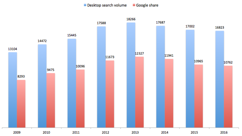
According to ComScore, people using a regular ol’ desktop computer to search peaked in 2013. Each following year, desktop searches have declined. I can’t imagine someone getting in a car accident, receiving a DUI, or seeking legal advice regarding a terrible work situation waiting until they make it home to start looking for a lawyer. Not to mention the effort involved in firing up the old Gateway computer (they don’t make those anymore) to start hammering on a mechanical keyboard (they do still make those) to find the perfect attorney.

I can, however, imagine them pulling out their awesome new Galaxy S7 Edge (which they haven’t turned off since buying it) to do a quick mobile search and call directly from the SERPs.

Overall vs. Google Desktop Search Volume in US (MM)

desktop search volume in us 2009 2016 bar graph

Graph Source: SEL | Data Source: ComScore

Final Thoughts on the May Mobile Update

If your legal website is responsive, give yourself a pat on the back. If it’s not, there’s no time like the present to make you and your law firm more accessible to the people trying to find you. If you need help, we’re happy to chat: 206-209-2125.

Now, if I were a bettin’ man I would put money on the possibility that Google might roll-out a similar update for a more secured web

Google Playing with Click-to-Call Phone Numbers in Mobile Organic Results

Estimated read time: 3 minutes

In his blog post yesterday, local SEO guru Mike Blumenthal reported on click-to-call phone numbers now showing in mobile organic searches. What does this mean? Essentially, along with the normal website link and description, Google is now testing out clickable phone numbers directly in the search results for mobile searches. Let’s look at some examples from Mike’s blog post

Mobile Organic Click To Call AC Repair
In this example, the user was searching for AC repair businesses in Corpus Christi, Texas.


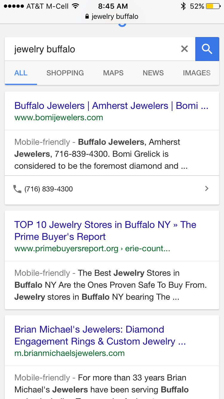
Mobile Organic Click Call Jewelers
The user was searching for local jewelers in Buffalo in this screenshot.

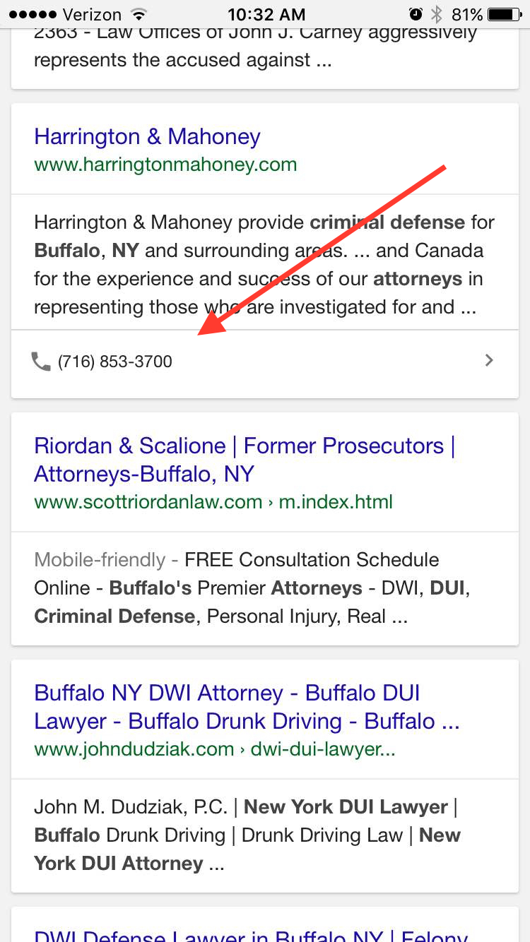
So what happened when I tried to replicate the click to call numbers for legal related search queries? (I’ll give you a hint: it worked.)

Mobile Organic Results Attorneys Buffalo
My search for “criminal defense attorney buffalo, ny” produced the click-to-call feature on page 3 of the results.


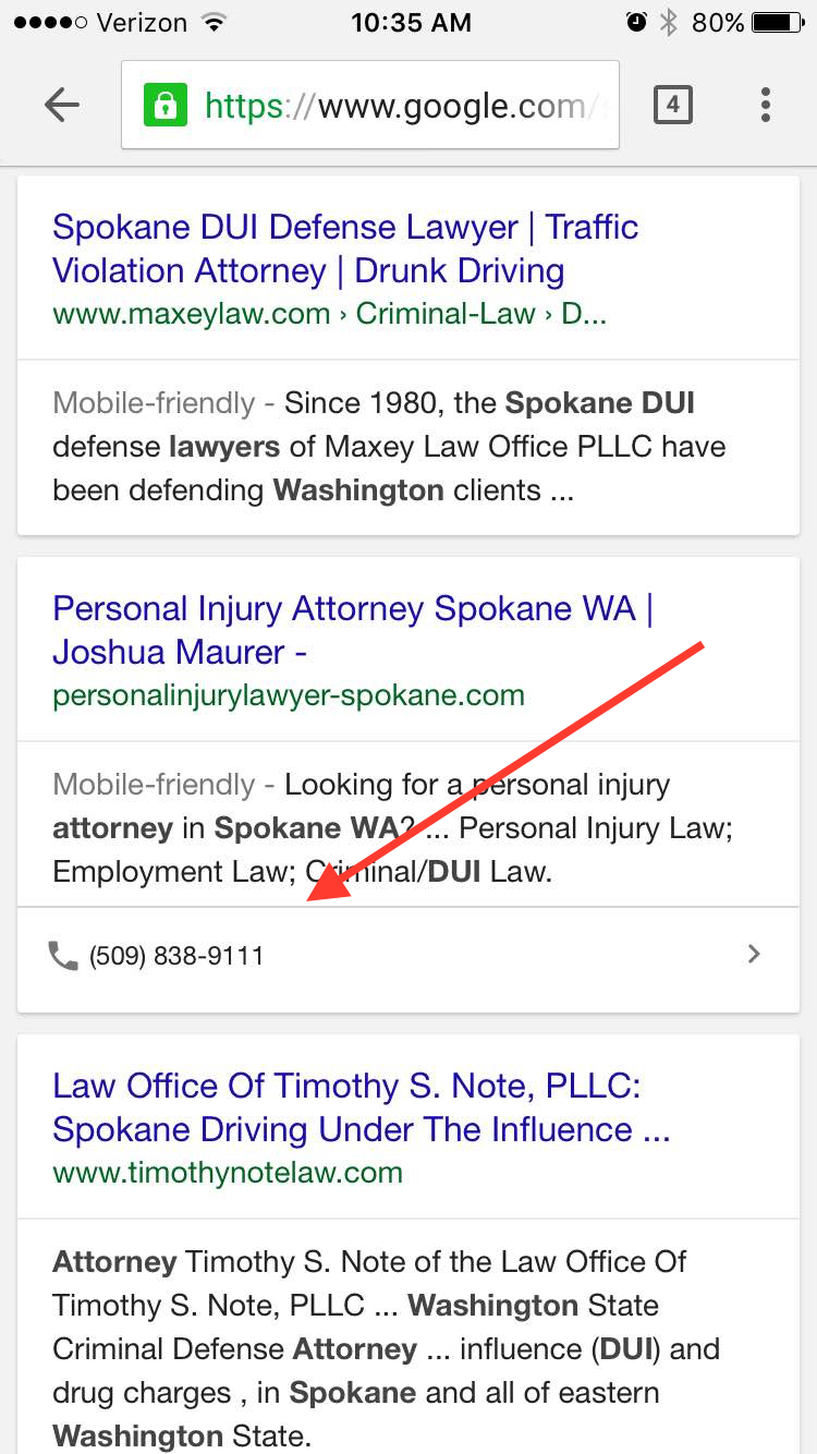
Mobile Organic Results Attorneys Spokane
In this example, you can see the click-to-call results on page 2 of the results for the query “dui attorney spokane wa”

Here’s what we know:

  1. The change was first noticed on February 29, 2016.
  2. Google is likely testing this feature – clickable phone numbers are not yet showing on the first results page (usually a solid sign this is a Google test).
  3. This is likely to be a mobile-only update.
  4. They are testing the new click-to-call feature in most service business searches, including legal search queries.

Why is this change significant?

It might not be. Most likely, this is just another test by Google to see how they can improve their user’s experience. We’ve seen mobile organic tests (remember colored separators on mobile?) like this before that never made it to the big stage. However, if this clickable phone number as part of the snippet is ultimately implemented across the SERPs (search engine results page) and not just sitting quietly on page 2, 3, or 4, there could be some major implications, both negative and positive.

Potential implications:

As an SEO, it’s not only fun, but also my job to speculate on the potential impact of Google’s tests. So what could this click-to-call change mean?

  1. Increased conversion rates. By removing one step for the user, they should be more likely to call your business.
  2. More holes in lead tracking. Much like in the local pack results, businesses probably won’t be able to use call tracking for the click-to-call number, thus creating a hole in lead reporting.
  3. NAP consistency will be key (with an emphasis on the P). If you have multiple conflicting phone numbers on your website – a common blunder in the legal industry – Google will be more likely to either display the incorrect number or not show your phone # at all for the click to call option.

Check back for updates – we’ll keep an eye on this for you.

“Responsive Websites” – What They Are and Why Your Business Needs One

Do you know what responsive websites are? Does your business already have one? If so, this post isn’t for you.

Do you keep hearing about the importance of responsive websites and mobile search? Not sure if your website is responsive? Don’t understand what responsive design means? This post is for you!

What Is Responsive Web Design?

Responsive Web Design is used to make your website look good and be easy to read/navigate – no matter what device your visitor is using. This means your website’s content/design/layout is going to change based on the screen size/orientation/resolution of the viewers screen. A responsive layout will ensure a good user experience across all devices. Your visitors won’t have to pinch zoom on their phones or have trouble navigating to the content they’re looking for.

If you only visit your website on one computer, you would never know if your website is responsive or not. Below is an example of a strong responsive layout. Notice how different layout elements shrink, move, and stack – depending on the device.

Responsive Websites

Not every responsive website is the same. There are many ways to implement responsive design on a website. They require adequate HTML architecture, CSS media queries, mobile navigation options, and much more.

I Love My Website, Why Does It Need to Be Responsive?

If you have an older static website design, it’s probably very difficult to use on mobile devices. Ever looked for a restaurant’s menu on their website from your phone? I bet you’ve found it very challenging to pinch zoom and navigate to one of their most important pieces of content. If your business website is not responsive, I guarantee that your visitors are having the same problem.

The Importance of Responsive Websites

Responsive websites are one of your biggest keys to more website traffic and conversions. The search engines know if your website is responsive and what it looks like on mobile devices. Google is simply more likely to serve up your website in mobile search results if it uses responsive design correctly.

It’s Official: Google Says More Searches Now On Mobile Than On Desktop

If your website isn’t mobile friendly, I would estimate your mobile traffic is around 10-25% of all your traffic. We’ve seen that number spike to around 40-50% once a responsive design is implemented. That change is due to a huge increase in mobile search traffic once a website has responsive design. With the increasing number of mobile devices on the market, more and more people are searching for local businesses with their phones and tablets.

How Can I Tell If My Website is Responsive?

The quickest way to tell, is to pull up your website on your desktop/laptop and your mobile device and see if the layout is different. This should be happening on every page of your website, ensuring all your content is mobile friendly. Try checking more than just your home page and see what happens.

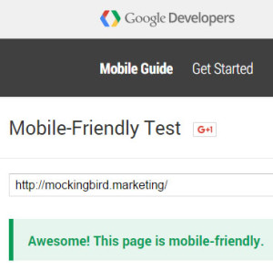
The more important test is Google’s Mobile Friendly Test. Try entering your URL into this tester on a few pages of your website. If you don’t see something like this… Mobile Friendly Test ResultYou should think about investing in responsive website redesign! You might also find some minor errors, like links that are too small. These kind of things can be easy for a web designer to change/fix and increase the mobile friendliness of your website.
What’s Next?

Google is working on a project called Accelerated Mobile Pages that will be rolling out in 2016. Their goal is to improve speed and quality of mobile websites and search results. From early examples, these pages look to be at the top of mobile search results. The earliest adopters will be major news outlets, but you can bet on this becoming and important feature for small businesses.

Automattic, the company founded by the WordPress platform founder, is already developing their AMP WordPress Plugin. This will allow WordPress sites an easier way to create Google’s Accelerated Mobile Pages. Once the benefits of these pages are clear, you can guarantee Mockingbird will be implementing this on all our sites.

Google Mobile Penalty Study Week 1 – mobile friendly +8%, unfriendly -4%

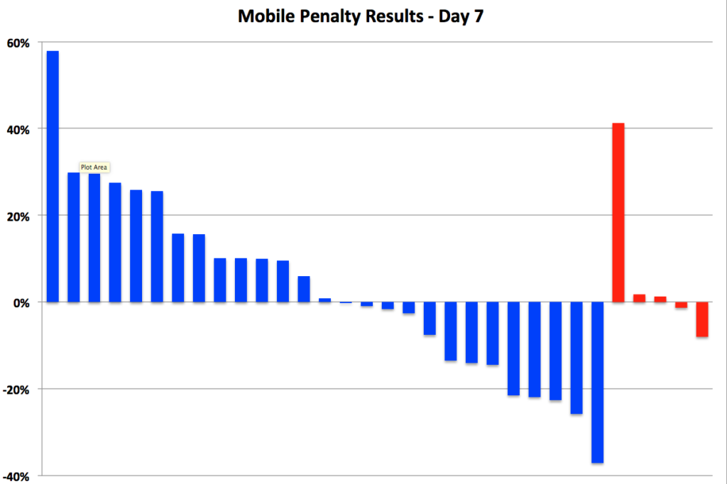
So we are a full week into Google’s well publicized mobile friendly algo update (or penalty, depending on how you want to market it) and at this point I’m regretting my decision to publish day-to-day updates as frankly, there’s been very little to update.  So far, in aggregate across the 59 sites we’re tracking, we’re seeing average daily mobile search traffic up 8% on mobile optimized sites and down 4% on non-mobile friendly sites.

Hardly the search traffic apocalypse forecasted by SEO geeks and The Google.  And remember, mobile natural search traffic represents just a portion of overall legal webite traffic, so this blip doesn’t register meaningfully on anyone’s radar.  Representatives from The Google assured us that the roll-out could take, a week, perhaps a week and a half to fully roll out so perhaps there’s more to be seen, but so far it looks like the only thing the Google mobile update has done is push a little more work to website developers.

In the graph below, the blue bars represent mobile friendly sites, the red ones, not-so-mobile-friendly.

mobile day 7


Google Mobile Penalty Study Day 6 – Mobile sites up 5%

So we’re almost a full week into the hype of the Google Mobile Penalty Roll-Out and…. maybe, just maybe, we are seeing some logical results.   Aggregating data across the 59 sites in the study – we’re now seeing natural search traffic from devices for mobile optimized sites up by 5% while non mobile sites are showing an aggregate decline of 3%.  Kind of what you’d expect from the algo update, albeit at a much smaller scale.

Or maybe not…

Individual data across the sites in the study remains highly variable with significant swings both up and down.  The graph below shows a wide range of performance across the largest of both optimized (blue) and unoptimized (red) sites.

Mobile Day 6

Conclusions?  The only conclusion I can draw is that either a)we still have a very long way to go until the algo really rolls out completely OR b)the impact of this algo change was grossly overestimated by SEO geeks (including myself.)