“Responsive Websites” – What They Are and Why Your Business Needs One
Do you know what responsive websites are? Does your business already have one? If so, this post isn’t for you.
Do you keep hearing about the importance of responsive websites and mobile search? Not sure if your website is responsive? Don’t understand what responsive design means? This post is for you!
What Is Responsive Web Design?
Responsive Web Design is used to make your website look good and be easy to read/navigate – no matter what device your visitor is using. This means your website’s content/design/layout is going to change based on the screen size/orientation/resolution of the viewers screen. A responsive layout will ensure a good user experience across all devices. Your visitors won’t have to pinch zoom on their phones or have trouble navigating to the content they’re looking for.
If you only visit your website on one computer, you would never know if your website is responsive or not. Below is an example of a strong responsive layout. Notice how different layout elements shrink, move, and stack – depending on the device.

Not every responsive website is the same. There are many ways to implement responsive design on a website. They require adequate HTML architecture, CSS media queries, mobile navigation options, and much more.
I Love My Website, Why Does It Need to Be Responsive?
If you have an older static website design, it’s probably very difficult to use on mobile devices. Ever looked for a restaurant’s menu on their website from your phone? I bet you’ve found it very challenging to pinch zoom and navigate to one of their most important pieces of content. If your business website is not responsive, I guarantee that your visitors are having the same problem.
The Importance of Responsive Websites
Responsive websites are one of your biggest keys to more website traffic and conversions. The search engines know if your website is responsive and what it looks like on mobile devices. Google is simply more likely to serve up your website in mobile search results if it uses responsive design correctly.
If your website isn’t mobile friendly, I would estimate your mobile traffic is around 10-25% of all your traffic. We’ve seen that number spike to around 40-50% once a responsive design is implemented. That change is due to a huge increase in mobile search traffic once a website has responsive design. With the increasing number of mobile devices on the market, more and more people are searching for local businesses with their phones and tablets.
How Can I Tell If My Website is Responsive?
The quickest way to tell, is to pull up your website on your desktop/laptop and your mobile device and see if the layout is different. This should be happening on every page of your website, ensuring all your content is mobile friendly. Try checking more than just your home page and see what happens.
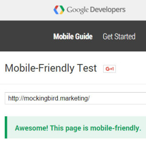
The more important test is Google’s Mobile Friendly Test. Try entering your URL into this tester on a few pages of your website. If you don’t see something like this…  You should think about investing in responsive website redesign! You might also find some minor errors, like links that are too small. These kind of things can be easy for a web designer to change/fix and increase the mobile friendliness of your website.
What’s Next?
Google is working on a project called Accelerated Mobile Pages that will be rolling out in 2016. Their goal is to improve speed and quality of mobile websites and search results. From early examples, these pages look to be at the top of mobile search results. The earliest adopters will be major news outlets, but you can bet on this becoming and important feature for small businesses.
Automattic, the company founded by the WordPress platform founder, is already developing their AMP WordPress Plugin. This will allow WordPress sites an easier way to create Google’s Accelerated Mobile Pages. Once the benefits of these pages are clear, you can guarantee Mockingbird will be implementing this on all our sites.