Your Logo Is Big Enough
As a designer, I receive many requests for changes by clients regarding a design that I have created. I almost always get asked, “The logo is small, can you make it bigger?”, “I can hardly see the logo, could you make that bigger?”. I understand that you may be proud of your logo and you want it to be prominent, however, the size of your logo isn’t the most important aspect of your website nor should it be the main focus of the site.
Many people also believe that their brand is their logo. A brand is much bigger than just a logo and it can be presented throughout the entirety of the design. Your brand is how your firm represents itself, how you treat clients, your messaging and positioning, the overall experience that someone has with your service and firm. Yes this does include your logo however the logo on your website should never distract the user from the messaging on your website and it should never compete with it.
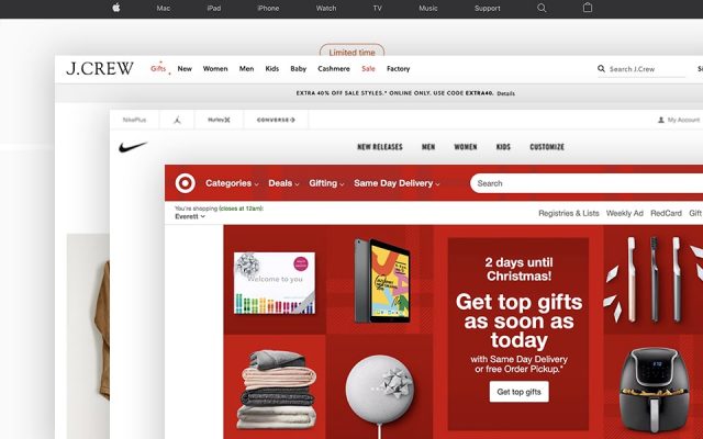
Large logos can come off cheesy and look amateur. Take a minute to check out the size of the logo for these well-respected brands:

It’s a pretty slim chance that your firm can compete with the same brand recognition as Apple, J.Crew, Nike, and Target, but you can still strive to achieve a similar professional, polished look. Your logo isn’t the focal point of the design. It can throw off the entire balance of the design and make it look cheap if it’s too large.
That brings me to another issue and a shameless plug from yours truly. If your logo needs to be larger to read it, it’s not a good logo. Logos should be scalable and recognizable at any size. If you need an updated logo or a logo redesign OR BRANDING, hit us up.
I have a strong opinion that if you include LLC, Law Firm, Attorneys, etc in your logo – it’s unnecessary and looks a bit amateur. People, who come to your website are aware that you are a lawyer, or a law firm, or an attorney..get it? That goes for you too, Esquires.
Also, if you ABSOLUTELY need to make your logo bigger, please watch this video.
