Laws of UX Series: Aesthetic Usability Effect, Doherty Threshold and Fitts’s Law
 |
March 4, 2020
|
March 4, 2020
Laws of UX are a collection of design heuristics created by Jon Yablonski to help designers leverage psychology to create more human-centered experiences. You can find explanations for each law on the website lawsofux.com, as well as an in-depth case study regarding his thought process on his website, jonyablonski.com
This will be a series of blog posts briefly covering the many laws and how they can help designers create better experiences for law firms.
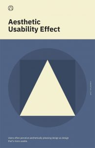 1) Aesthetic Usability Effect
“Users often perceive aesthetically pleasing design as design that’s more usable.”
Users tend to assume that things that look better will work better, even if they aren’t actually more productive. Users who visit your website may have a positive emotional response to the visual design of your website, making them more tolerant of minor usability issues while using your site. When I say “minor usability issues” I mean text with low contrast, spelling errors, or typography that isn’t consistent. The Aesthetic Usability Effect does have its limits and when the design puts aesthetics over usability, users will lose patience and leave your site.
For example, I have seen law firm websites that include huge hero images on practice area pages that cover the entire screen without including any information until moving down the page. The page may look appealing at first with a large, beautiful image at the top, however, the image that is taking up the entire screen may be seen as an annoyance once they are trying to complete specific tasks.

2) Doherty Threshold
“Productivity soars when a computer and its users interact at a pace (<400ms) that ensures that neither has to wait on the other.”
Fast websites are fun to use. Laggy, slow response websites suck. The longer it takes for your website to respond to a request, the longer your user is taking to think of what they want to do next. If you keep your users waiting, they will find what they are looking for on another law firm’s site. As a general rule, you want to provide feedback to a user’s request within 400ms in order to keep their attention.
If your website has any loading screens that aren’t imperative to the functionality of the site, fancy page transitions, or anything else that may slow down their experience with your site, you are doing more harm than good with those “cool” features.
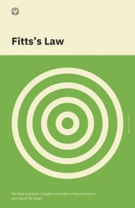
3) Fitts’s Law
“The time to acquire a target is a function of the distance to and size of the target.”
A touch target is an area that responds to user input. Make sure that all touch targets are large enough for users to understand their functionality and easily accessible for users to interact with.
Many law firm websites (and websites in general) have touch targets that aren’t clearly visible or are located in hard to reach places from where a users finger can reach(looking at you hamburger menus located at the top left or right on mobile screens). Make sure any touch target on your website is easily recognizable and accessible to avoid confusing your users.
Stay tuned for the next post in this series where I go over Hick’s Law, Jakob’s Law and the Law of Common Region.