Our client is a personal injury firm providing top-notch legal services to clients in Seattle, Idaho, Montana, and Utah. They are a distinguished firm focused on client loyalty. They hired us to improve and solidify their brand personality both internally and externally as well as redesign their Seattle based law firm’s website.
Objectives
• Create a modern, scalable and user-friendly website
• Improve content strategy, architecture, and navigation
• Incorporate updated brand personality
• Improve SEO performance
Current Site
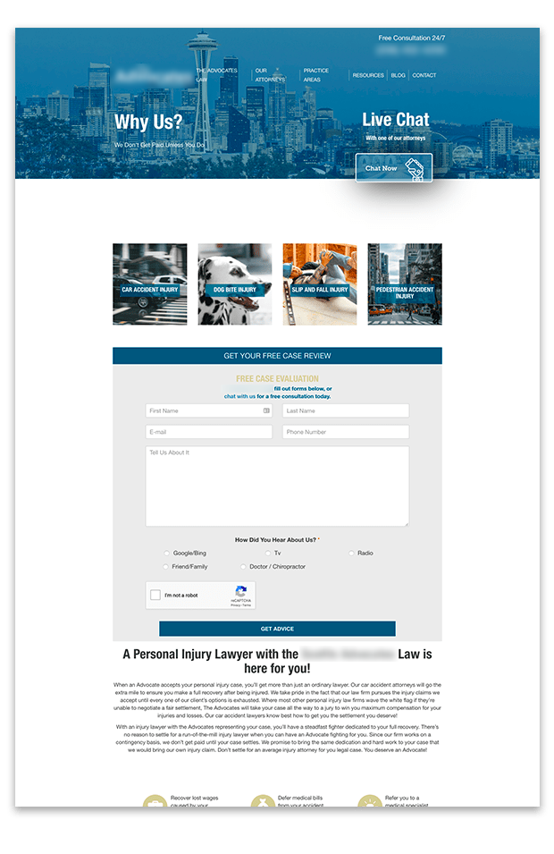
Our client came to us with a couple of challenges. Their current website lacked the ability to provide them with functionality they needed, was difficult to manage, didn’t reflect their brand personality, and had broken elements. They were looking to implement a brand refresh with an updated color palette. Their new website also needed to promote their loyalty to their clients and their established experience.

Wireframe and Prototyping
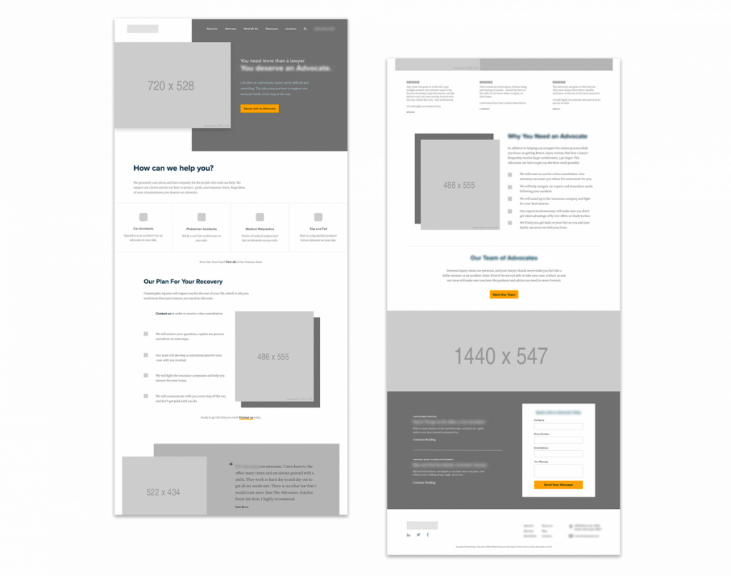
During the wireframe and prototyping phase, we layout content and focus on specific functionality to make sure that it meets the needs of our users. These are extremely basic and created primarily in grayscale in order to focus more on the functionality of the site instead of the visual aspect.

Visual Design and Brand Identity
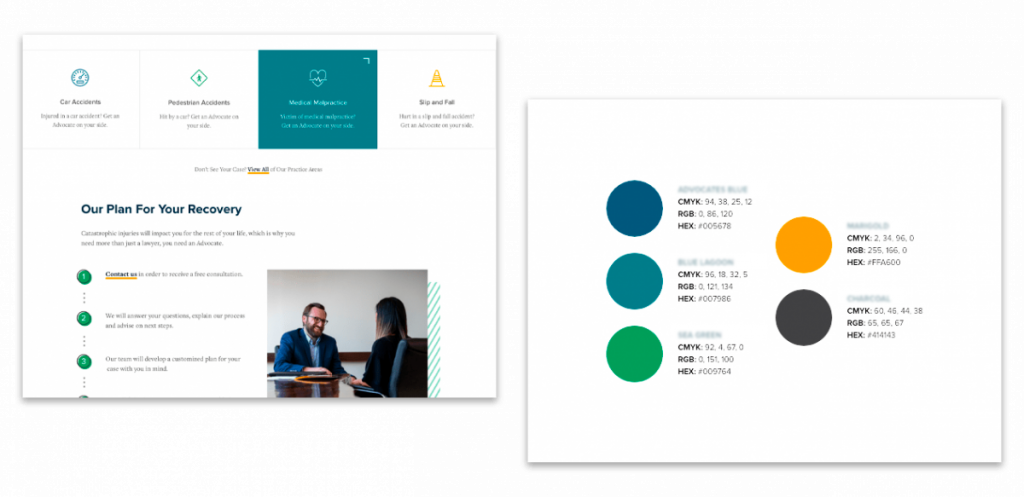
Once the general framework is in place from the wireframe phase, we move into the visual design phase where we focus on the look and feel of the site. During this phase, we will decide on imagery, color options, typography, iconography and other elements that are in-line with the client’s brand identity in order to create a visually pleasing user interface.

Putting it All Together
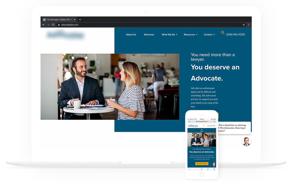
The new website is clean. The layout is simple and provides potential clients with the information they’re looking for in an effective, easy to consume layout that reflects their brand personality. The addition of new photography, an updated color scheme, and brand-focused content strengthened their digital presence and better reflects their firm and services.
