The Project
Our client is a firm located in Washington focusing on injury law. With over 50 years of combined experience, they work hard to ensure that their clients receive the compensation they deserve.
The Challenge: Can we create a user-friendly experience while communicating our client’s personality, experience, and client loyalty?
Their previous website was dated, slow, and didn’t stand out. Our client needed a website that was fast, easy to use, and simple to update. They also needed their website to properly project their confidence and dedication to their clients.
While their previous site wasn’t the worst we have seen, our clients definitely needed an update. They experienced trouble making changes to the site since it was built on a dated framework. Their images, while personable and professional, were too large and needed to be compressed in order to increase page speed. Most importantly their personality was not represented properly.
Our team decided that a full custom website redesign was what needed to be done in order for them to be successful.
The Solution
We walked our client through our Custom Website Redesign process which includes:
• Discovery – Review current website data, demographics, tech, and competitive research.
• Content – Content audit, content outline, and planning.
• Design – Wireframes, brand boards, mockups, and prototypes.
• Build – Migration, template builds, staging.
• QA – Reviewing and trying to break site, accessibility, speed tests.
• Launch
Wireframe and Prototyping
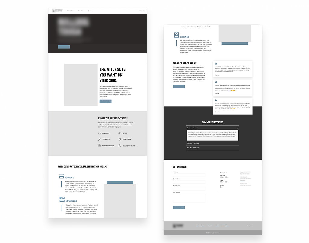
During the wireframe and prototyping phase, we layout content and focus on specific functionality to make sure that it meets the needs of our users. These are extremely basic and created primarily in grayscale in order to focus more on the functionality of the site instead of the visual aspect.

Visual Design and Brand Identity
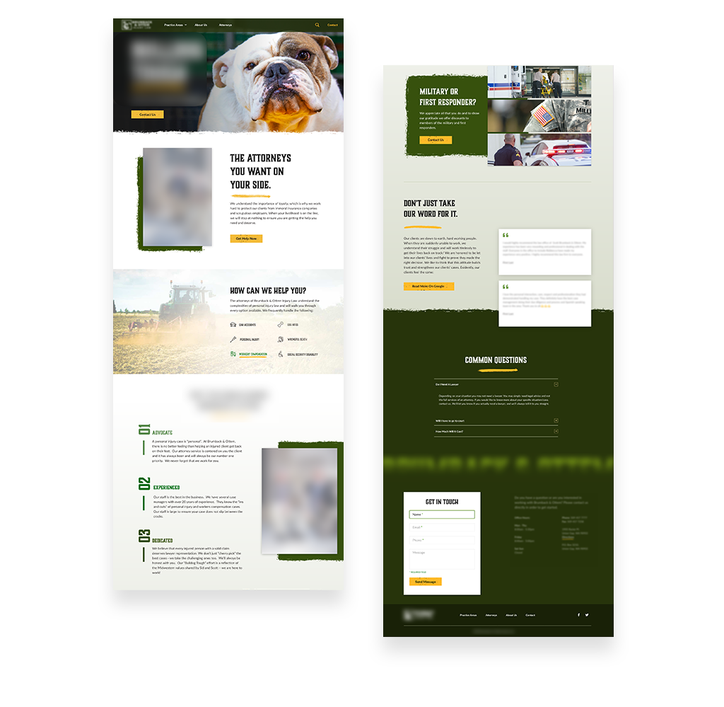
Once the general framework is in place from the wireframe phase, we move into the visual design phase where we focus on the look and feel of the site. During this phase, we will decide on imagery, color options, typography, iconography, and other elements that are in-line with the client’s brand identity in order to create a visually pleasing user interface.

The Result
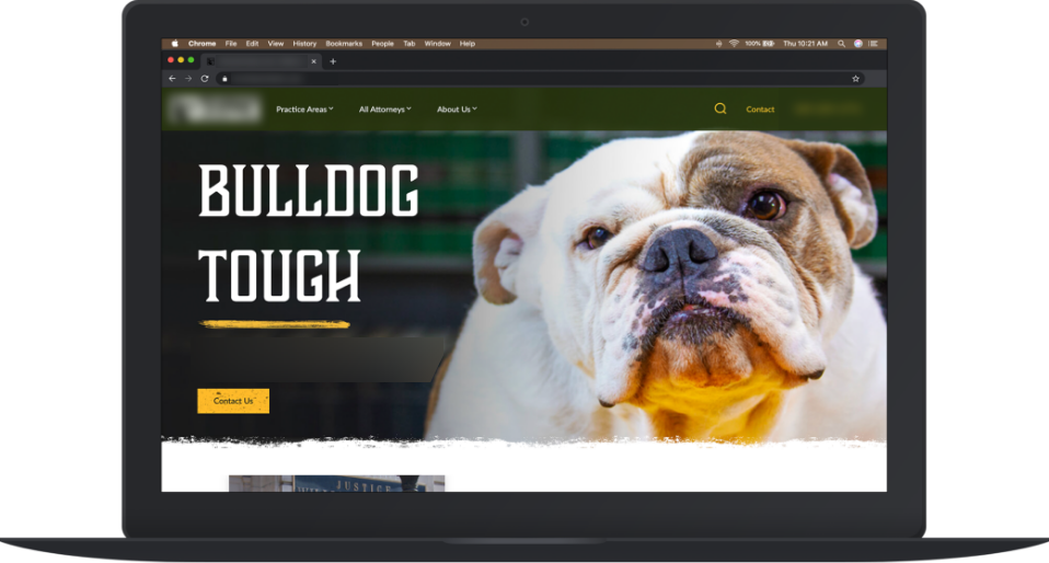
The new website is fast. The layout is simple and provides users with valuable information quickly. The visual design reflects their brand personality. Bold, tough, and loyal. With new photography, an updated color scheme, and user-focused content strengthened their digital presence and better reflects their firm.
