Laws of UX are a collection of design heuristics created by Jon Yablonski to help designers leverage psychology to create more human-centered experiences. You can find explanations for each law on the website lawsofux.com, as well as an in-depth case study regarding his thought process on his website, jonyablonski.com
This will be a series of blog posts briefly covering the many laws and how they can help designers create better experiences for law firms.
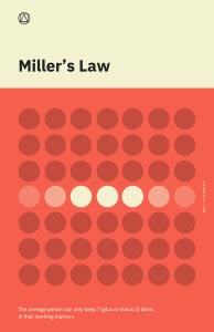 1) Miller’s Law
“The average person can only keep 7 (plus or minus 2) items in their working memory.”
Milller’s Law is named after George Miller, a cognitive psychologist who believed that the average number of objects the average human can hold in working memory is seven (plus or minus two).
Miller’s law suggest we use “chunking” in order to organize content in a way that will help users process and understand content easily. Chunking, meaning short “chunks” of information that users can read and scan quickly.
If your website consists of massive walls of content, it might be worth rewriting into grouped, shorter content that is easier to consume. Here are some guidelines to follow that will help you follow Miller’s Law and create content that is easier for your users to consume.
- Use bullet-points and easy to read headings.
- Try to keep text lines around 50-75 characters.
- Use clear visual hiarchy and group related items together
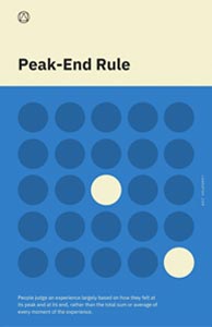 2) Peak-End Rule
Think back to a particular memory. It could be your first concert, a holiday from your childhood or a family vacation. The memory that you recall is created from how you felt during its peak moments and how it ended. This is because users focus on the most intense points of an experience and the final moments.
This is important when thinking about your firm. Whether it’s your website, your intake or how you conduct yourself with your clients, people will only recall the most intense points and the final moments that they experienced with you. It is also important to point out that people recall negative experiences more instensly than positive ones.
Focus on the moments that your service has been the most helpful, or areas where you feel you excel the most and make them better.
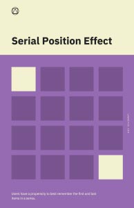 3) Serial Position Effect
“Users have a propensity to best remember the first and last items in a series.”
The Serial Position Effect describes how the position of an item in a sequence affects how users recall them. You can find this being put to work in many website navigations. The items within the navigation that are most important are almost always on the far left and the far right (home being far left and contact being far right). This isn’t always the case, especially when designers feel the need to remove the navigation on desktop and opt for a hamburger menu (hint: don’t do that).
In order to minimize strain for your users, try to limit the number of options you have in your navigation, practice area cards, etc. In most cases, more is not necessarily better.
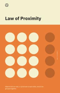 1) Law of Proximity
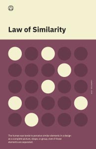 2) Law of Similarity
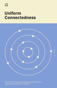 3) Law of Uniform Connectedness
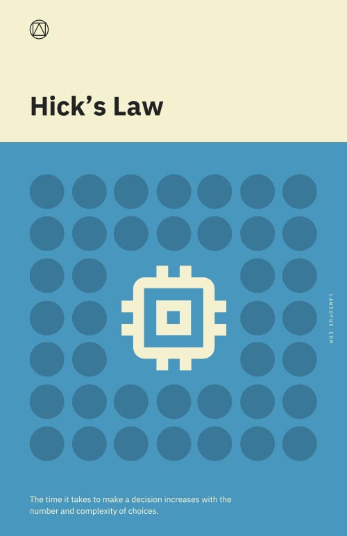 1) Hick’s Law
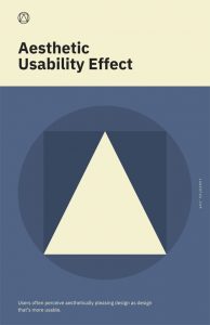 1) Aesthetic Usability Effect